Votes:
Spencer/Beaverman
JomoRyan
Despite the fact that the designs are all wrong and the shirt looks painted on yet ripped at the same time, the figure overall isnt bad, horrible quality though I suggest saving as .png and using the 1200x1200 pics. The recolour is good and not over saturated or fake looking. alot of the selection you made on the pants were very jagged though, you can fix this by using the pen tool or after selection going to select>modify>smooth. The Shirt would look way better if you had made it stick out more than have the same depth of the chest. Keep working on those thing man and you'll get better.
Double B
They all just look blurred with highlights and also unproportioned. When resizing hold shift to keep proportions. Although highlights and blurring/smudging is all you really need to make a decent head you over use these tools. I suggest finding a decently lighted head and practicing different blurring and smudging techniques and practice using a mix of the dodge midtones, highlights and shadows tools.
kDa
I think if the head had been done slightly different it woullda been awesome you've got all the right aspect but some parts look way to blurry and messy clean it up and sharpen some parts and you're golden. The attire is good not much to say bout it other than not bad but not great either.
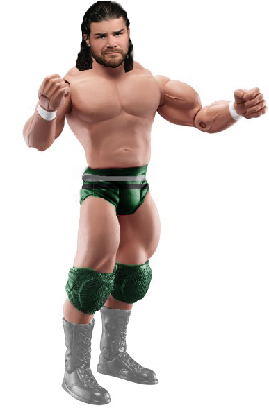
Spz
Head looks really horrible andhas smudged spots, the attire looks half assed and looks really messy this fig really lets down the duo and is the main reason I voted spencer and Beaverman. I suggest kda trades up in partners, perhaps have a few tag matches with his wse comrade?
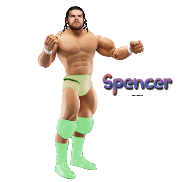
Beaverman
It looks good, not bad but great just good. Head is slightly blurry but the tones match and it fits, attire is good aswell once again not much to say about it although the elbow pads are really dark and choppy work on selecting and choosing the right tones.
Spencer
Pretty bad aswell, attire is far too bright and unrealistic. Head is too small but has some decent editing, if you redid the attire and resized the head it'd be good.
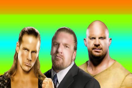
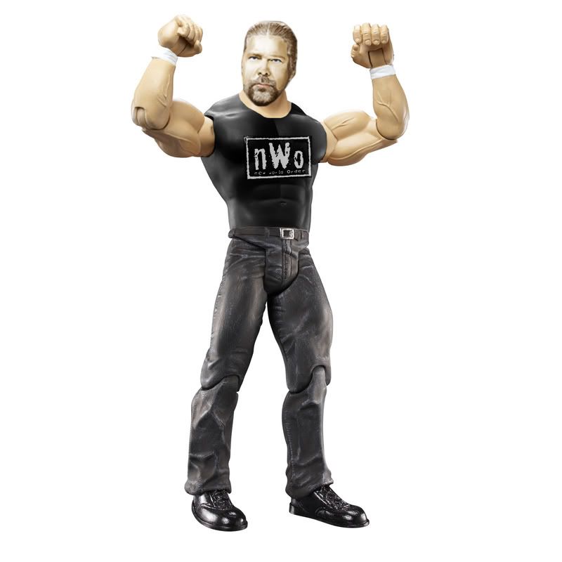
Teh Game
Love this. The head is superb and fits the lighting great. Attire looks great although I think you should look into drawing your own logos now you've improved alot. This would definately have been my Botw had Cabana not handed in.
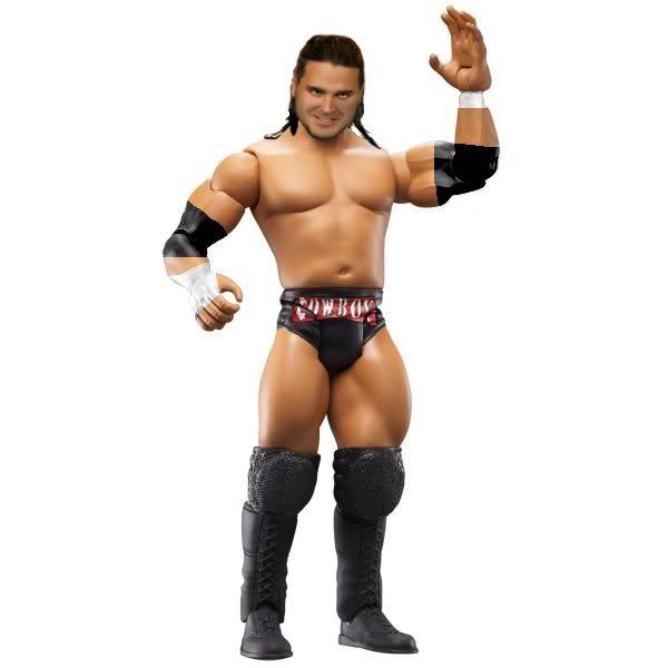
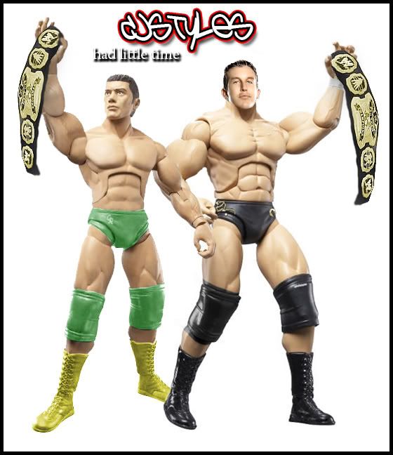
CJ
I really dislike this. I understand you didnt have much time but unless you did it in under 3 minutes that's not much of an excuse it takes very little to recolour properly and you didnt seem to be able to do this on cody and it's not too hard to resize a head properly, the head on Dibiase would take more time so I can understand why it may not look so good but the tones should at least match and be the head should be the right size.
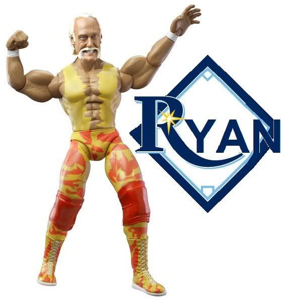
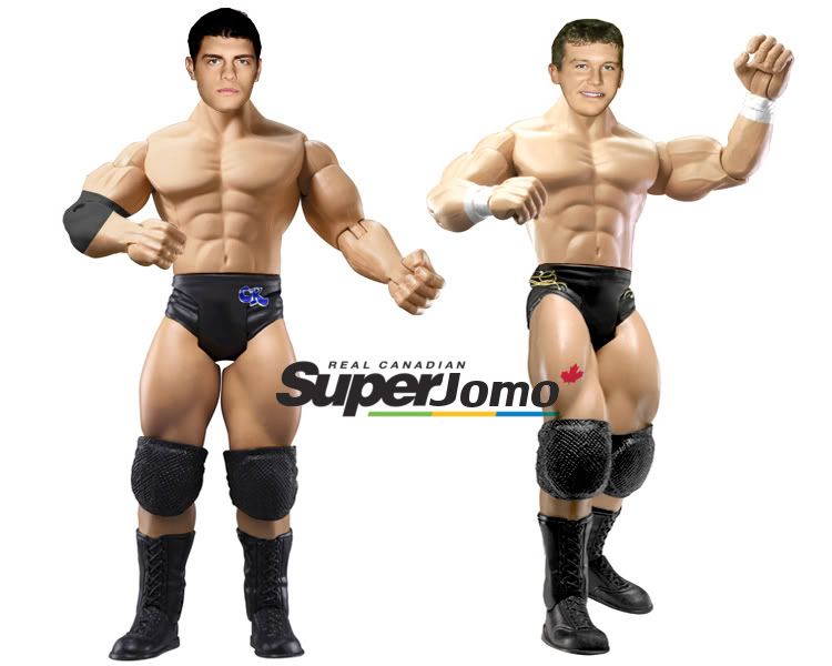
Jomo
I like the attires, not much done butthe finish looks great. Nice part choice. As usual heads are good, could be better could be worse. Only major problem I see is that the heads are slightly badly placed other than that overall good figs. Nice logo aswell

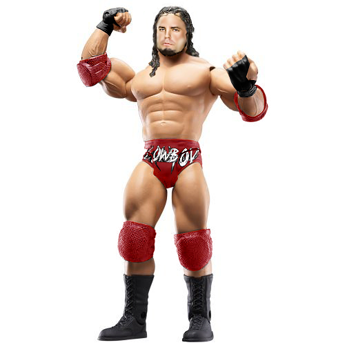
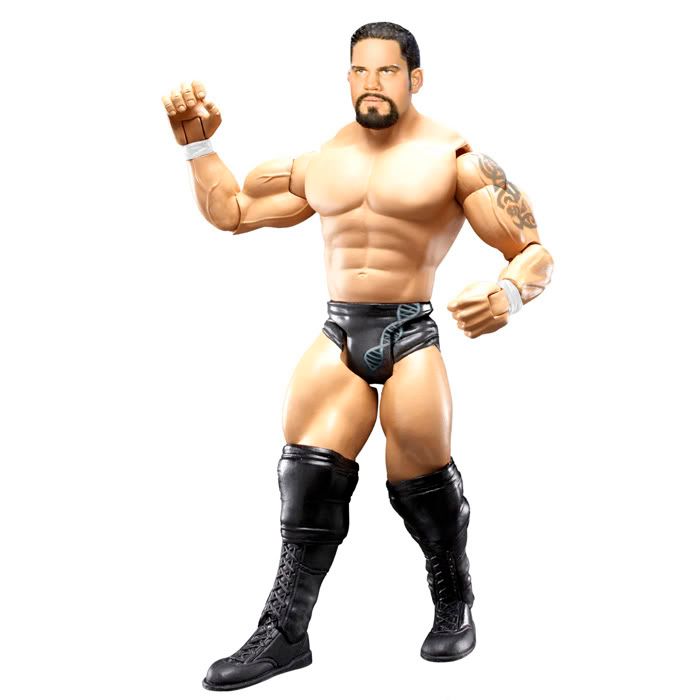
Duaner
Solid attire but not a fan of the head sorry, the tones are a bit odd and the skin just isnt smooth enough I suggest upping your smudge setting or something so it looks more smooth an plastic like.
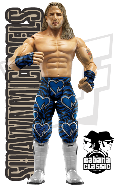
Cabana
As usual this is awesome, great head mod, doesnt look like you've done much but in a way it does if you get what I mean, I really dont know how you can be so awesome at head mods. Attire pwns, absolutely no flaws. So much detail and effort looks to have been put in, I apologise for not handing in.

Botw right here^
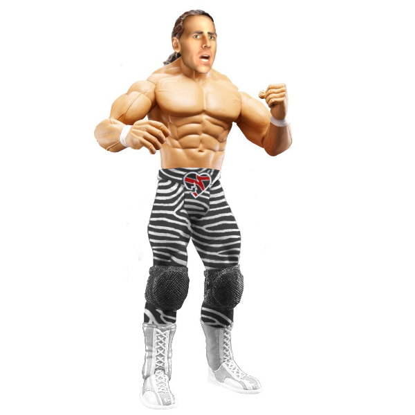
Bret
I dislike this the tones dont match the pants look odd and the head is blurry, mainly around the eyes. The attire designs look faded rather than overlayed or blended, the tones are way off on the head and it looks way to saturated and bright.
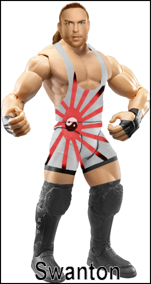
Swanton
Like bret's the attire looks faded rather than overlayed, this is a poor fig overall. Attire is incorrect and is missing alot of black. Head is horrible needs an overhaul of editing.
G1
This would be my third choice for Botw it's all great apart from the head I dunno whether it's the eyebrows or the beard or the head but it just looks stretched and demented you should stick to your picture mods method as that pwns. No real complaints about the attire only that the text should be more rounded on the tights.


![[MJH] Avatar](http://i56.tinypic.com/5x3ote.jpg)