|
|
Post by duan on Aug 25, 2008 23:31:42 GMT -5
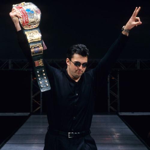
World Photoshop Federation Presents: Domination: "Goodby Sky Harbor" CardDate: August 25th 2008 Live From: Chicago, Illinois WPF International Championship Tournament; Round 3; Block A vs. Block B:Spencer vs. DuanerStip: Dean Malenko Spencer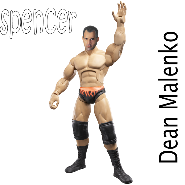 Duaner Duaner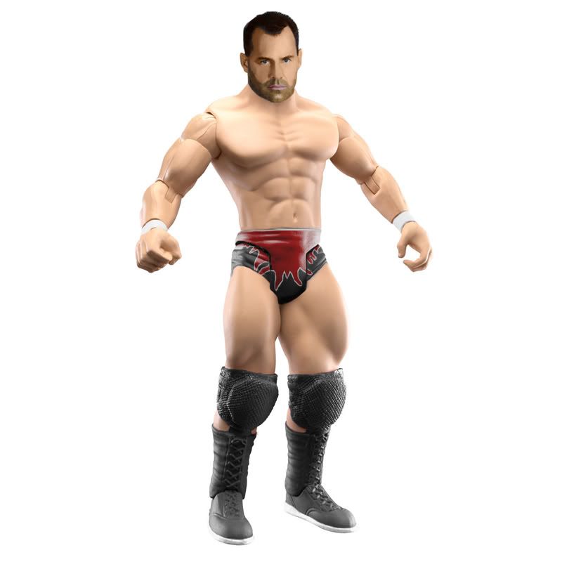 WPF International Championship Tournament; Round 3; Block C vs. Block D:Swanton vs. HazukiStip: WPF International Championship Tournament; Round 3; Block C vs. Block D:Swanton vs. HazukiStip: Bam Bam Bigelow Swanton
Head: A
Attire: B+
Creativity: A
Overall: A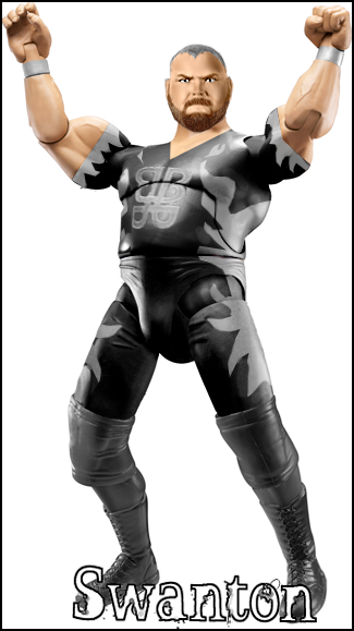 Hazuki Hazuki
Head: B+
Attire: B+
Creativity: B+
Overall: B+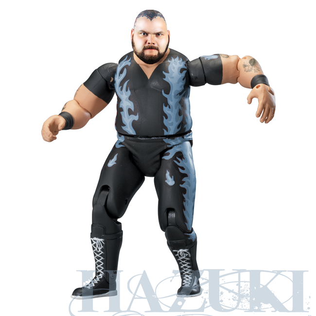 Honestly, I feel this is Swanton's best. Aced the head and the attire, plus making it DA is just grand. Hazuki also pulled out his best here, with a great head, but the attire just lacks the creativity of Swantons. Swanton gets my vote! EXCELLENT GUYS!Ryan vs. Honestly, I feel this is Swanton's best. Aced the head and the attire, plus making it DA is just grand. Hazuki also pulled out his best here, with a great head, but the attire just lacks the creativity of Swantons. Swanton gets my vote! EXCELLENT GUYS!Ryan vs. That Great Muta GuyStip: CM Punk RYAN WINS! 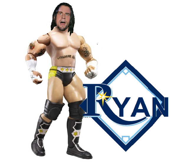 Mr. Korn & Pagels vs. SPZ & .kdAStip: Mr. Korn & Pagels vs. SPZ & .kdAStip: Your Favortie Tag Team of All Time Korn/Pagels
Heads: C+/B
Attires: B+/B+
Creativity: B+/B+
Overall: B/B+ 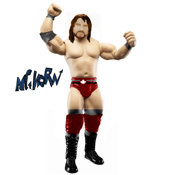 SPZ/.kdA SPZ/.kdA
Heads: B+/B
Attires: B+/B+
Creativity: B+/B+
Overall: B+/B+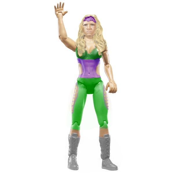 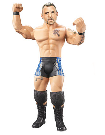 Good undercard match here. My vote has to go to .kdA/SPZ. Great work on the Beth, SPZ. .kdA, you've just come on the seen and you are great. Caws.ws has been good to you. Korn/Pagels, you guys did some solid work. Good match from the 4 of you!Teh Game vs. JOeYStip: Good undercard match here. My vote has to go to .kdA/SPZ. Great work on the Beth, SPZ. .kdA, you've just come on the seen and you are great. Caws.ws has been good to you. Korn/Pagels, you guys did some solid work. Good match from the 4 of you!Teh Game vs. JOeYStip: Armando Estrada in Ring Gear Teh Game
Head: B+
Attire: A
Creativity: B+
Overall: B+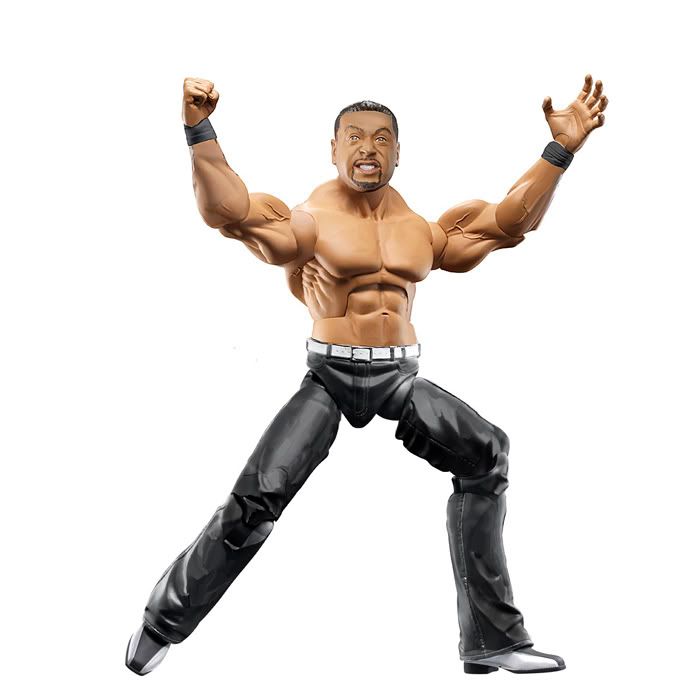 JOeY JOeY
Head: B+
Attire: B+
Creativity: B+
Overall: B+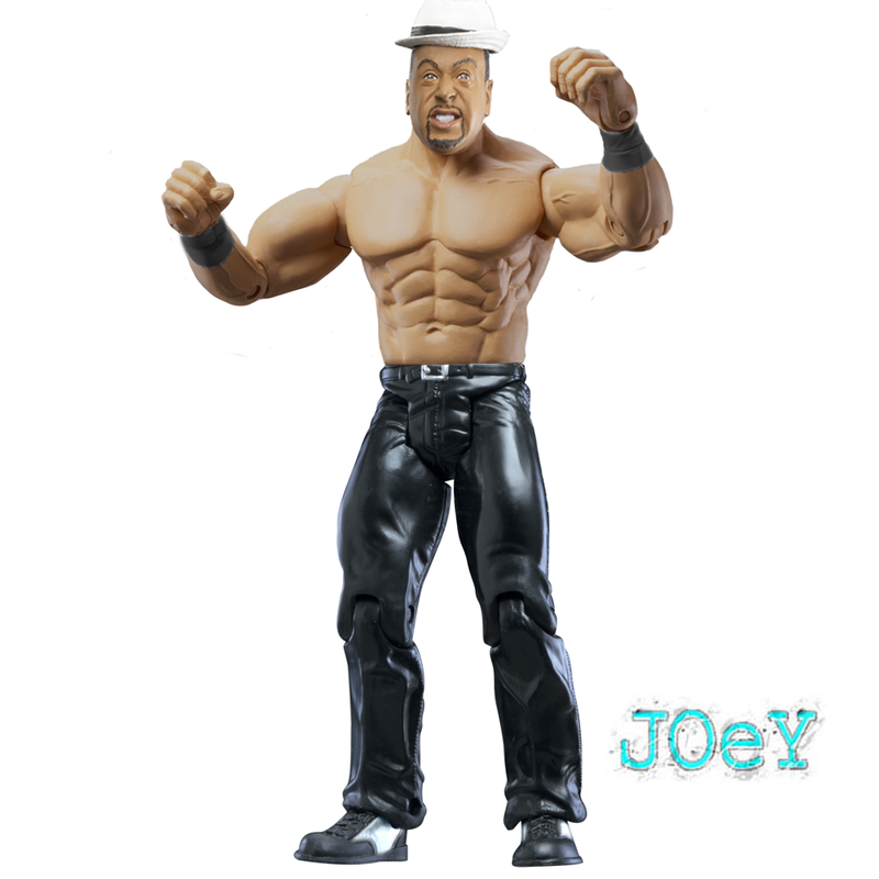 Teh Game wins it here. I feel that his is cleaner and the attire is completely accurate. Good solid match here.Jomo vs. Teh Game wins it here. I feel that his is cleaner and the attire is completely accurate. Good solid match here.Jomo vs. KodyStip: Santino Marella in his Singlet JOMO gets the win! 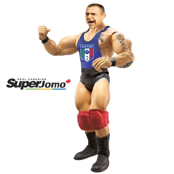 Cass vs. CJStip: Scotty Riggs CJ gets the win! 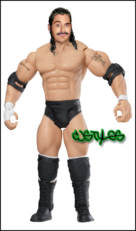 Main Attraction: GreatBretOne vs. Cabana & MJHStip: Main Attraction: GreatBretOne vs. Cabana & MJHStip: Colt Cabana & K-Kwick in DA Form *THIS MATCH IS ON HOLD! GREAT ONE HANDED IN, BUT ITS NOT SHOWING UP FOR ME. FOR NOW, LOOK AT THE PRETTY FIGURES!*GreatBretOne (thus far)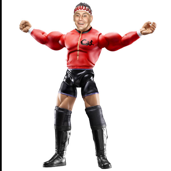 Cabana/MJH Cabana/MJH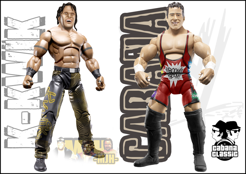 LAST MATCH WILL BE UP SOMETIME TOMORROW HOPEFULLY! BOTW: Swanton noreasonnovote. |
|
Deleted
Joined on: Jun 30, 2024 16:21:27 GMT -5
Posts: 0
|
Post by Deleted on Aug 26, 2008 8:17:56 GMT -5
Woah BOTW. Thanks Duaner.
Spencer vs. Duaner
Spencer - Head is good. Attire is good. Well Done. Prolly your best. Rating: B+
Duaner - Head is great. Attire is good. Great Job. Rating: B+
Vote: Tough choice. Attires are equal, but i feel Duaner's head is slighly better.
Mr. Korn & Pagels vs. SPZ & .kdA
Korn/Pagels - Pagels - I like the attire. Head is ok. Rating: B
Korn - Attire is ok. Head isnt very good. Rating : C+
SPZ/Kda - SPZ - I like the head. Figure is stilll messy in areas. Rating: C
Kda - Wow. Your great. Head is awesome. As is the attire. Great Job. Rating: A-
Vote: SPZ/Kda Kda brings this team to victory. All figures have flaws cept kdas. Well Done.
Teh Game vs. JOeY
Game - Parts switchesare good. So is the tone switch. Good job. Rating: B
JOeY - PArt switches are good. Rating: B-
Vote: Teh Game. as he did more work to his figure.
BOTW: MJH
|
|
|
|
Post by [MJH] on Aug 26, 2008 8:58:48 GMT -5
Spencer Vs. Duaner
This is a close match and both figures are good, Duaner's attire is cleaner and it looks more accurate but the head looks kind of odd, th colours in the face look weird and the editing to make it look platic could've been done better. I prefer spencer's head it has a more plastic feel, but as I said I dont like the attire.
Vote: toss up
Swanton vs. Hazuki
I'm not a fan of Swanton's head the shadow looks horrible and overall it doesnt look plastic imo. The attire is alright but some of the lines are jagged, and the kneepads down are a lighter shade then the rest of the attire. Hazuki's is pretty good I like the head and although he just did a recolour it's still ok.
Vote: Hazuki, although he didnt do as much the head makes up for it.
Spz/kda vs. Korn/Pagels
Pretty easy choice for me, Spz and kda did great I love the head on beth and the attire is good, Kda did a great job aswell only real problem I see is the head looks a tad large.
Vote: Spz/kda, great job guys.
Teh Game vs. Joey
Game did more work but I dislike the whole look of the torso with the pants and the angle looks odd, Joey's is simple and clean overall it looks pretty good.
Vote: Joey, Overall cleaner and better fit together.
|
|
|
|
Post by kda on Aug 26, 2008 9:20:25 GMT -5
YAY! I'm wining my first match!
Spencer vs. Duaner
Spencer - I dont like the head thtat much, the shadow on it kills it. BTW The attire is pertty good.
Duaner - I'm still not a that big fan of the head bbut I think it's better than Spencer's. The attire is great.
Vote: Duaner, both attire and head I think that look a little better.
Swanton vs. Hazuki
Swanton- Looks really nice to me, the fire designs on the attire need some work and I'm not a big fan of the shadow on the face but other than that really nice fig.
Hazuki- The attire looks really good but the face looks over dodged.
Vote: Swanton, not by much but his head looks better than Hazuki's head.
Teh Game vs. JOeY
Game - Great edit, the head is great and the attire and body look great as well.
JOeY - Great edit as well, the only flaw I see is that the skin tone on the body looks kinda weird, it doesnt shines.
Vote: Teh Game, because of the skin color.
BOTW: Cabana
|
|
Joliet Jake
Superstar
 Ya see, me and the Lord have an understanding.
Joined on: Apr 25, 2007 14:11:00 GMT -5
Posts: 738
|
Post by Joliet Jake on Aug 26, 2008 9:21:16 GMT -5
SPENCER vs. DUANER
Spencer: Head looks too much like a picture still and not figure/plastic like. The tones are different than the body. Hair looks grey and has a weird white line around in inside edge on the forehead in a shadow area, it should be darker not lighter since thats where the shadow on the forehead is at. Head also looks a tad too small in proportion to the body. The attire is simple but effective, coloring looks nice but the orange logo on the tights looks really blurry on the edges going down the front of the tights. You're improving though, keep working on the things i mentioned above.
Duaner: Head is the appropriate size, blending/smudging looks well done. Tones are different than the body. The body is very light but the head is very dark, using the dodge tool on some areas on the head might help. Beard doesn't look bad but its a strange color or brown with too much yellow tones in it, needs to be a darker shade and the beard is a bit blurry on the right side. Torso works well for malenko and the tights design is nice, i like that it looks painted on and it represents how an actually jakks proto would look like.
My Vote: Duaner - I feel like Duaner did a better job on his attire, both duaner and spencers heads need a bit of work but Duaners was slightly more realistic than spencers so he goes the overall nod on this match up.
---------------------------------------------------------------------------------------------------------------
SWANTON vs. HAZUKI
Swanton: The blending/smudging on the head is quite good, definitely one of your better heads ever. Tones match up pretty good here as well. The head looks just a tad too small her proportionately. Beard looks pretty good and is a natural color. I like the body type you chose here and the tights designs is pretty good, it has a few rough patches (ie: around the edges of both sleeves and the BBB logo on the chest looks really blurry) Also try to keep in mind about your joints and use the eraser tool or burn tool on those areas to darken them up a bit... you're designs will look more natural is you do that. Overall though i think you really stepped it up this week, hopefully you're figures will remain at this standard and continue to improve.
Hazuki: Head still looks too much like a picture and not plastic/figure like. Size and placement are pretty good. Tones are close but still a little off due to the head having too much contrast. I would had liked to see you try a different body instead of the existing bigelow proto one, flame recolor looks good though.
My Vote: Swanton - Overall a better figure and swanton also put more work and creativity into his as well so he gets the nod here.
---------------------------------------------------------------------------------------------------------------
Ryan: You've got quite a bit to work on, but you're still new, you'll eventually get there. Your cuts are still extremely jagged and rough, it looks like you're using the magic wand tool, instead use the polygonal tool for your cuts, its a very simple tool to use and you can get much cleaner cuts using it. Your tones dont match, use the color balance, hue/saturation tools to help get the tones to match better, the head has way to much red on it. The head also still looks like just a picture pasted on a figure body, work on your techniques more and smooth out the fine features. Head is also way too large for the body, The body parts also suffer from very rough cuts and the right arm is a different color than the left and both are different colors than the torso which is also a different color than the legs. Tattoo's looks rough and are one of the hardest things to photoshop. Tights design looks sloppy and i see alot of red in the white areas. Same goes for the boots. Keep practicing though.
---------------------------------------------------------------------------------------------------------------
MR KORN/PAGELS vs. SPZ/KDA
Pagels: Head is too large, face is too blurry and doesnt look like a figure head. Tones are off as well. Torso choice is effective for eric young, the logos on the tights and knee pads really lack any depth, try setting them to soft light and desaturate the area under them for more highlights/shadows to show through.
MrKorn: The head is too large for the body, hair doesn't have a natural brown color to it, the face is completely missing any distinguishing features, dont over blur or smudge more than you need to. Head looks sloppy, take more time and practice more. Torso works well but the tights and knee pads re-color are rough, the knee pads lost their depth, use hue/saturation and color balance for your re-colors. Tights design is flat, use the dodge/burn tool to add highlights and shadows or experiment with layer properties to give it a more natural look. It also goes right over the joints, erase the areas over the joints and it would look better. the design would also be curved along the contour the waist follows, not straight across, same goes for the knee pad underlay, they need to curved around the thigh, not just going straight across.
Spz: This is one of your better figures imo. The head has a plastic/figure type feel to it, hair looks a little blurry though and if you used to burn tool on parts of the hair it would make the shadows pop better. The top torso design is kinda sloppy though and looks too blurred out and not crisp like how the painting would actually look on a figure., same goes for the pants. Boots recolor are nice though.
KDA: You're very impressive for just starting out, hope to see you still around. Head has a plastic/figure feel to it, the highlights/shadows are nice. the head is just slightly too large for the body. Tattoos look pretty good and the tights logos are cool but shouldnt go over the joints, use the eraser tool or burn tool on those areas. Leg tattoo goes up on the tights just a tad though. Overall nice figure and is the highlight of this match. Great job.
My Vote SPZ & KDA. KDA's figure won it for me, he did a lot of things right.
---------------------------------------------------------------------------------------------------------------
TEH GAME vs. JOEY
Teh Game: Looks like Estrada's proto head, i cant tell if you modded it in anyway. I like the body pieces choosen heres, very well thought out. I would ahve flipped the bottom though, so the belt would had been under the belly button, the way it looks right now looks very unnatural. I like the pants and the boots look cool.
Joey: I like the part choices, would have liked to see a head without the hat though. Clean simple figure.
My Vote: Teh Game - i like the head choice better, i like the body pieces and the pants/boots better on teh games as well so he goes the nod on this one.
---------------------------------------------------------------------------------------------------------------
Jomo: Cool looking figure, just a few observations. The santino logo needs to be skewed on one end, the left side would look smaller since its farther back than the right side. I'm not a big fan of the head since it still looks too much like a picture and not how an actual figure head would look.
---------------------------------------------------------------------------------------------------------------
CJ: Interesting figure, head looks good imo other than the mustache, looks weird too me for some reason. Attire is simple but looks very clean. I like the parts you chose as well. Nice figure.
|
|
Spz
Main Eventer
Joined on: Apr 18, 2006 23:16:03 GMT -5
Posts: 1,946
|
Post by Spz on Aug 26, 2008 9:52:48 GMT -5
Teh Game vs. JOeY
teh game- i dont like the torso choice but the outfits is great
joey- i like everything on yours but the outfit sorry
vote- Teh Game
Swanton vs. Hazuki
Swanton-great figure i love everything on it
Hazuki-yours is good to but swantons outift is better.
Spencer vs. Duaner
i dont like either face bujt duaners outfit is better
my vote-duaner
|
|
|
|
Post by cjs. on Aug 26, 2008 10:12:57 GMT -5
Thanks for the comment, Cabana. </3 people who don't hand in.  Cabana botw! |
|
|
|
Post by Tim Tebow™ on Aug 26, 2008 10:19:46 GMT -5
Duaner: both heads are equal, but duaner's head wins it for me. Swanton: you pretty much said it duaner, i feel this is swanton's best. great head, great attire. SPZ/.kdA: beth isn't the best, but santino wins it for me. besides being a little blurry, the head is great. Teh Game: cleaner figure. and the head is completely accurate. i won.  |
|
|
|
Post by tehgame on Aug 26, 2008 22:59:54 GMT -5
Dauner-His figure is very well done and Spencer's head dosent look plastic enough.
Swanton-Ur best figure till date.More work shown cause all hazuki did was recolour and photoshoped a Bam Bam when Swanton made the whole attire.
KDA/SpZ-Is it just me but I think that KDA made both figures cause both heads look like they have the same style.
|
|
|
|
Post by duan on Aug 27, 2008 0:33:40 GMT -5
Voting done!
just gunna chalk the MJH/Cabana vs. GB1 match as a draw.
|
|


![[MJH] Avatar](http://i56.tinypic.com/5x3ote.jpg)