|
|
Post by pimpmaster5000 on Jul 4, 2008 21:48:23 GMT -5
import wanted me to post this separate  my fhs axel rotten 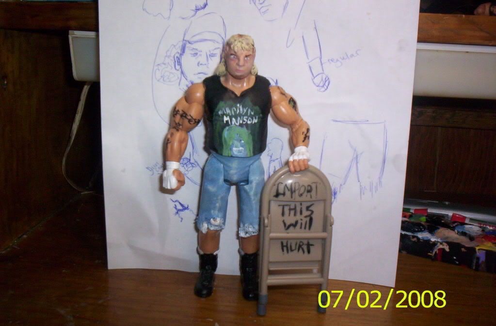 |
|
|
|
Post by EddieGuerreroRules on Jul 4, 2008 21:54:28 GMT -5
that is one ugly mfer and he doesnt even have the same skintone
maybe we can have a match next ppv
|
|
Importracer
POSSIBLE BAD TRADER
Joined on: Dec 1, 2006 18:36:40 GMT -5
Posts: 1,383
|
Post by Importracer on Jul 4, 2008 21:55:04 GMT -5
since i will be gone the weekend i figured we could go ahead and post are match.becca can move it in the offical snme post. CLASSIC AJ STYLES toybiz head,kickers and jacket full skintone and hand painted logo's i changed styles knee pads 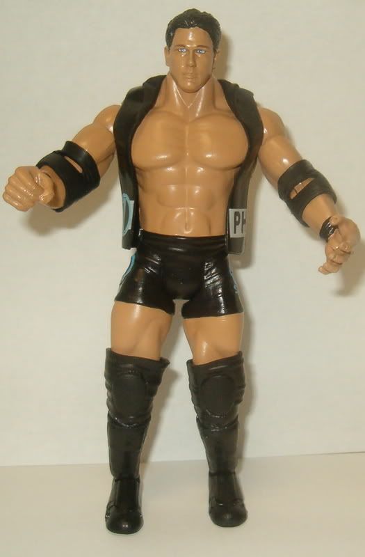 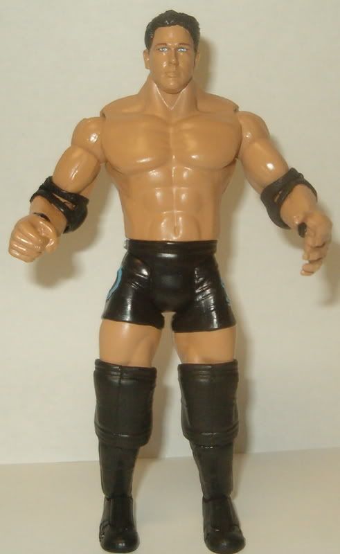 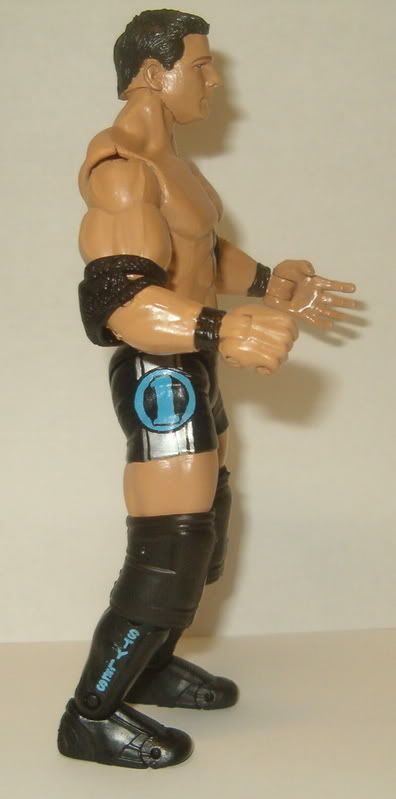 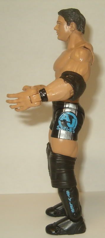 |
|
|
|
Post by justicesmith12 on Jul 4, 2008 22:21:33 GMT -5
The head's skin tone isn't the same, but besides that it's fine.
|
|
|
|
Post by Classic Collector: The Return on Jul 4, 2008 22:51:07 GMT -5
Aside from the head on Axl I like the figure, for some reason the paint you used on his face makes it look like you just painted the nose on. Import your Styles is really good I just don't like the DA kneepads on him because they look way too bulky.
|
|
|
|
Post by pimpmaster5000 on Jul 4, 2008 23:24:41 GMT -5
guys i sculpted it from scratch
|
|
|
|
Post by EddieGuerreroRules on Jul 4, 2008 23:45:22 GMT -5
and...we salute you for it now dont come back lol jp but even if it was the greatest face sculpt you still have two different skin tones!
|
|
|
|
Post by NYdream™ on Jul 4, 2008 23:47:42 GMT -5
guys i sculpted it from scratch a fhs only works only works if it is done good.... this makes him look slighltly de-formed... it was a nice effort.... but it is not that great..... |
|
|
|
Post by Titantrap: Gold Club Veteran on Jul 5, 2008 4:40:01 GMT -5
Angus i actually think this is a good effort, but the fact that you didn't do the full skintone killed it. But i will give you a ton of credit for a FHS, and a decent one at that. Import, nice skintone, logo painting is smooth, but the head is too small for the body, the kneepads are waaaay too big and overall it's an uninspired attempt. I doubt if you had faced Gate or Beyondo, this would've been the one you chose. It seems you phoned it in against Angus and that shows a lack of respect. I put forth the same effort against him that i would've against anyone. You should've done the same.
|
|
Deleted
Joined on: Nov 18, 2024 0:38:04 GMT -5
Posts: 0
|
Post by Deleted on Jul 5, 2008 8:21:54 GMT -5
its acually little scary, the head tone does not even match the figure try painting it
|
|
Importracer
POSSIBLE BAD TRADER
Joined on: Dec 1, 2006 18:36:40 GMT -5
Posts: 1,383
|
Post by Importracer on Jul 5, 2008 10:34:29 GMT -5
Angus i actually think this is a good effort, but the fact that you didn't do the full skintone killed it. But i will give you a ton of credit for a FHS, and a decent one at that. Import, nice skintone, logo painting is smooth, but the head is too small for the body, the kneepads are waaaay too big and overall it's an uninspired attempt. I doubt if you had faced Gate or Beyondo, this would've been the one you chose. It seems you phoned it in against Angus and that shows a lack of respect. I put forth the same effort against him that i would've against anyone. You should've done the same. how do you figure little effort?full skintone had to mod the head and do the logo's. |
|
Gonzo Customs
Main Eventer
   
Joined on: Dec 24, 2001 4:51:46 GMT -5
Posts: 4,056
|
Post by Gonzo Customs on Jul 5, 2008 11:37:32 GMT -5
Angus - I am quite impressed with this one. Although the skintone doesn't match and the painting is all over the place on the shirt, you stepped it up. Finally you are showing the signs of improvement you were showing several months ago. Keep putting this much effort into your customs and you are sure to improve. The FHS is not great, but you have the scale correct and the mouth and nose look ok. Overall the FHS doesn't look right, but, many FHS do not. I commend you for the effort on this one.
Import - The skintone is ultra smooth, logos look to be spot on. Head mods look good as well. The DA kneepads do look a tad large, but I like the DA kneepads overall. Now finish your Curry Man.
My vote goes to Import.
|
|
|
|
Post by Titantrap: Gold Club Veteran on Jul 5, 2008 13:42:08 GMT -5
Angus i actually think this is a good effort, but the fact that you didn't do the full skintone killed it. But i will give you a ton of credit for a FHS, and a decent one at that. Import, nice skintone, logo painting is smooth, but the head is too small for the body, the kneepads are waaaay too big and overall it's an uninspired attempt. I doubt if you had faced Gate or Beyondo, this would've been the one you chose. It seems you phoned it in against Angus and that shows a lack of respect. I put forth the same effort against him that i would've against anyone. You should've done the same. how do you figure little effort?full skintone had to mod the head and do the logo's. come on buddy, skintone requires zero effort for you or me, and logo paining is not difficult for you. But what i said was it was an uninspired effort. There's nothing that stands out about it. You still win, but it's because you just have more talent in the first place. |
|
Importracer
POSSIBLE BAD TRADER
Joined on: Dec 1, 2006 18:36:40 GMT -5
Posts: 1,383
|
Post by Importracer on Jul 5, 2008 14:22:50 GMT -5
how do you figure little effort?full skintone had to mod the head and do the logo's. come on buddy, skintone requires zero effort for you or me, and logo paining is not difficult for you. But what i said was it was an uninspired effort. There's nothing that stands out about it. You still win, but it's because you just have more talent in the first place. i tought it was a fun figure to do i enjoyed doing the logo's .and i plan on changing the knee pads if i find the new style kneepads |
|
|
|
Post by pimpmaster5000 on Jul 5, 2008 15:13:22 GMT -5
import wants me to delet the match,but screw him
|
|
Sandy
POSSIBLE BAD TRADER
Joined on: Dec 17, 2004 14:33:52 GMT -5
Posts: 5,868
|
Post by Sandy on Jul 5, 2008 15:23:07 GMT -5
Jesus Christ no wonder nobody attempts FHS's anymore. Because when they do you people rip the mother effer to shreds. How about we remember for a second that it was a complete sculpt. Not a head swap from a toybiz figure or a JAKKS real scan figure. So lets give the guy credit for his FHS at least looking human.
I like it. The skintone is a big issue with me but besides that it isn't half bad. The hair is very nice and has nice volume and shape to it. The nose is a little too fat for Axl. If you shaved it down at the bridge and shape those nostrils it would do a lot for the sculpt and actually resemble Axl a lot more than it currently does. The tattoos are pretty well done but they are way too dark. You need to blend in your skintone mix with straight black and it will give it a more realistic look. The denim shorts look amazing as far as the painting goes but you need to add some stitching and pockets. The rips look very well executed. The shirt is horrible to me, I don't remember what the original looks like but if you are capable of pulling off a halfway decent FHS you should be able to paint better than that. It looks like you got lazy. Overall I like the figure. Good job. Keep practicing those head sculpts.
Import. I had no idea a toybiz AJ head fits that well on a JAKKS body. I like the figure overall. The logos look very well done. Everything is nice but it just isn't an Import custom, you know? You seemed to have half-assed this one like you were to busy to really concentrate on it and make something amazing. But it is still a good figure, it is just I know you can do far more than this.
|
|
Importracer
POSSIBLE BAD TRADER
Joined on: Dec 1, 2006 18:36:40 GMT -5
Posts: 1,383
|
Post by Importracer on Jul 5, 2008 15:46:50 GMT -5
import wants me to delet the match,but screw him i said since becca did not like it getting posted delete it until she posts it.so screw you |
|
Importracer
POSSIBLE BAD TRADER
Joined on: Dec 1, 2006 18:36:40 GMT -5
Posts: 1,383
|
Post by Importracer on Jul 5, 2008 15:49:14 GMT -5
we need the judges to vote on this
|
|
|
|
Post by wwe4ever on Jul 5, 2008 17:05:30 GMT -5
Angus- Not bad actually. The FHS looks decent but the lower part of the face looks kind of funny. The two different skintones kind of ruin the custom. Painting is nice and smooth though. It's also a clean paintjob as well. The modded jean shorts look good and I like the bleached effect. His tattoos look good and lol at what's painted on the chair.
Import- I like this custom but it is not your best work. The AJ head is the best to use on an AJ custom, even though you have to put the ra peg in it. The two different skintones kind of ruin this figure as well. I'm not fan of different skintones on one custom. The painting on the tights is smooth and I like the logos. The kneepads don't look good on him. I also would have used the old kickpad mould with elbow pads as the knee pads on him. You are the winner but I'm disappointed compared to how good it could have been.
|
|
Importracer
POSSIBLE BAD TRADER
Joined on: Dec 1, 2006 18:36:40 GMT -5
Posts: 1,383
|
Post by Importracer on Jul 5, 2008 18:20:17 GMT -5
Angus- Not bad actually. The FHS looks decent but the lower part of the face looks kind of funny. The two different skintones kind of ruin the custom. Painting is nice and smooth though. It's also a clean paintjob as well. The modded jean shorts look good and I like the bleached effect. His tattoos look good and lol at what's painted on the chair. Import- I like this custom but it is not your best work. The AJ head is the best to use on an AJ custom, even though you have to put the ra peg in it. The two different skintones kind of ruin this figure as well. I'm not fan of different skintones on one custom. The painting on the tights is smooth and I like the logos. The kneepads don't look good on him. I also would have used the old kickpad mould with elbow pads as the knee pads on him. You are the winner but I'm disappointed compared to how good it could have been. How can there be 2 skintones?the figure has a full painted skintone |
|

