|
|
Post by Cass on Feb 9, 2007 17:46:38 GMT -5
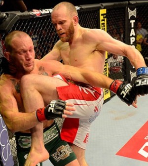
Didn't come out great.... i need some new brushes tips and comments appreciated, but i cant fix anything, because i never saved the unflatened image   |
|
|
|
Post by LAXxxx305 on Feb 9, 2007 17:50:42 GMT -5
That looks very nice. I love how you have the faded Master Pics.
|
|
|
|
Post by jeffhardykillz on Feb 9, 2007 18:39:06 GMT -5
its really good, but the text is kinda hard to read. 8.9/10
|
|
|
|
Post by waylon on Feb 9, 2007 19:07:17 GMT -5
Im not a fan. The main cut looks really low quality. I dont like the text either, it just doesnt fit Masters. The background is decent, but there looks to be a corner of a picture not blended well as you can clearly make it out. Overall, its just average. Nothing special, but its not terrible either.
|
|
|
|
Post by Cass on Feb 9, 2007 19:09:58 GMT -5
yeah, im going to try something else later.... thanks for the replies
|
|
|
|
Post by hulkamaniaisrunnin on Feb 9, 2007 19:12:11 GMT -5
I can see a couple pic lines and the left sid of the main psd is kind of choppy. Like I have said before...this isn't your best work.
|
|
|
|
Post by noni on Feb 9, 2007 23:22:51 GMT -5
the main pic dosnt look to good but over all i think its ok, might wanna have more couler.
|
|