Revvie®
Main Eventer
 Somewhere between Reality, and the Absurd
Joined on: Jun 29, 2005 1:04:26 GMT -5
Posts: 4,327
|
Post by Revvie® on Dec 12, 2006 11:45:36 GMT -5
|
|
|
|
Post by destructiondan on Dec 12, 2006 12:25:34 GMT -5
dude are you like 1 million year old or something no offense
|
|
|
|
Post by destructiondan on Dec 12, 2006 16:23:11 GMT -5
good sig though  |
|
|
|
Post by sickchrismondo on Dec 13, 2006 7:36:52 GMT -5
dude are you like 1 million year old or something no offense dude are you like a complete tard or something no offese? It's okay. But it's criminally basic. The outer glows on the font and the bottom right picture look really out of place, and the picture on the left looks a bit out of proportion. Try using a different layout and maybe using just one picture on a smaller space. Try adding some effects and work on the text a bit. Use some brushing. Right now it's about a 3/10 from me, but If you work around and look at some tutorials it could be much better. Also it needs more colour, it's too plain. |
|
Revvie®
Main Eventer
Somewhere between Reality, and the Absurd
Joined on: Jun 29, 2005 1:04:26 GMT -5
Posts: 4,327
|
Post by Revvie® on Dec 15, 2006 11:30:51 GMT -5
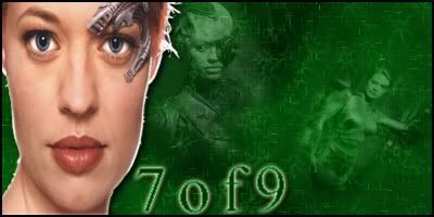
added 7of 9...tried to us brushes....tried is the key word
|
|
|
|
Post by Mole on Dec 15, 2006 11:41:53 GMT -5
I'm not really going to comment on the Bobby Darin one since it's pretty bleh. However, you got some good things going in your 7of9 sig.
The brushing is pretty well done, all things considered, and the blending on the picture in the center is also nice. However, that could just be because the brushing overlaps it or something like that. You need to work on your cuts. I recommend using the pen tool. If you need help with that, PM me and I'll either answer questions you got or give you my AIM/YIM/MSN account so that we can IM.
The drop shadow shouldn't be there, especially since parts of the cuts are pretty gross. Same with the text, though instead of bad cuts, the text is rough and low quality. Also, something that you should work on is making the main picture fit in the color scheme of the graphic. You don't need to make it fully green, just a slight tinge. Even a little bit will go a long way. Also, in reference to the Bobby Darin sig, you do not want to use a glow around your main image in general, especially if the cuts (even if it's only in certain spots) are choppy. I'd basically just say don't glow anything unless you either make it spread so far out that it just blends or it's transparent enough where the glow stands out more than the image that's "glowing."
There's obviously room for improvement, but there's always lots of room for improvement with anybody. Except maybe Mal, Archie, and those folk, though they probably see flaws in their own stuff that they can improve on.
|
|
|
|
Post by classicfan on Dec 16, 2006 12:27:46 GMT -5
the 7 of 9 is crap..srry dude but the cutout sucks and its tooo bland
|
|
Revvie®
Main Eventer
Somewhere between Reality, and the Absurd
Joined on: Jun 29, 2005 1:04:26 GMT -5
Posts: 4,327
|
Post by Revvie® on Dec 16, 2006 13:23:09 GMT -5
Mole, thanx alot for you comment and i will prolly try to get in contact with you when i get back home, Classic Fan..not to be rude but unless you actually planning on saying something constructive, its best not to say ne thing at all. I'm still new to this and i need advice and want it...not just "its crap" thats rude and unhelpful...so yea please refrain from saying ne thing on my stuff unless you plan to give help. Thanx again to Mole!
Revvie.
|
|
|
|
Post by classicfan on Dec 16, 2006 13:38:28 GMT -5
Mole, thanx alot for you comment and i will prolly try to get in contact with you when i get back home, Classic Fan..not to be rude but unless you actually planning on saying something constructive, its best not to say ne thing at all. I'm still new to this and i need advice and want it...not just "its crap" thats rude and unhelpful...so yea please refrain from saying ne thing on my stuff unless you plan to give help. Thanx again to Mole! Revvie. my bad dude...u need to add a brush or somethings and work on the cutout |
|
Revvie®
Main Eventer
Somewhere between Reality, and the Absurd
Joined on: Jun 29, 2005 1:04:26 GMT -5
Posts: 4,327
|
Post by Revvie® on Dec 18, 2006 10:51:00 GMT -5
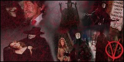
Added V for Vendetta, trying to get better at blending pictures well, hence the reason its just a bunch pictures and not really ne cuts.
|
|
|
|
Post by classicfan on Dec 18, 2006 13:38:21 GMT -5
still not liking it
|
|