|
|
Post by crissangel on Oct 19, 2008 16:01:15 GMT -5
Worse than mine!
|
|
The Mountain King
Main Eventer
 the artist formerly known as FL<O>
Joined on: Feb 19, 2008 17:51:45 GMT -5
Posts: 3,222
|
Post by The Mountain King on Oct 19, 2008 17:21:32 GMT -5
 yeah...right but if you would have changed the head tone it would have been good, except for the top of his head is gone
|
|
sh3rb1
Mid-Carder
Joined on: Feb 17, 2008 11:58:20 GMT -5
Posts: 96
|
Post by sh3rb1 on Oct 20, 2008 13:43:45 GMT -5
yeah...right but if you would have changed the head tone it would have been good, except for the top of his head is gone ye i got the head from a bad pic im gunna try and make the pic look better and may repost it later this week and thanks for the comment |
|
|
|
Post by ● kaneisdaman ● on Oct 21, 2008 4:10:24 GMT -5
here is my updated version 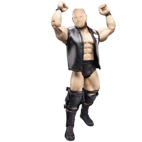 Still too light and small. Not to mention the black line around the head and the cut off bit. |
|
AV1
Main Eventer
Joined on: Jun 15, 2008 9:04:59 GMT -5
Posts: 2,870
|
Post by AV1 on Oct 21, 2008 13:19:17 GMT -5
it is okay but need alot of improvment
|
|
|
|
Post by efwa on Oct 24, 2008 22:43:35 GMT -5
heads a bit awkward but overll its pretty good
|
|
|
|
Post by mike420 on Oct 25, 2008 17:06:41 GMT -5
This is ma second atempt at making one from scratch so rate/hate and any tips how to get better would be greatly taken on board 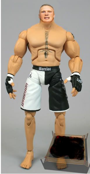 I CANT GET THE SKIN TONE RIGHT AND ITS ENOYIN any tips how to??? Well I do like this however there is some minor flaws. First try and not to smudge under the neck because it does make it much worse. If you are trying to make it look better so the head is not so edgy then just try and erasing it. With skintones just use Hue/Saturation and that will help you. |
|
sh3rb1
Mid-Carder
Joined on: Feb 17, 2008 11:58:20 GMT -5
Posts: 96
|
Post by sh3rb1 on Oct 26, 2008 12:20:11 GMT -5
This is ma second atempt at making one from scratch so rate/hate and any tips how to get better would be greatly taken on board I CANT GET THE SKIN TONE RIGHT AND ITS ENOYIN any tips how to??? Well I do like this however there is some minor flaws. First try and not to smudge under the neck because it does make it much worse. If you are trying to make it look better so the head is not so edgy then just try and erasing it. With skintones just use Hue/Saturation and that will help you. cheers thanks for the help will take it on board and use them next time i do one. thanks |
|
r44gz96
Main Eventer
WF 10+ Year Member
Joined on: Mar 8, 2009 10:42:07 GMT -5
Posts: 1,783
|
Post by r44gz96 on Oct 28, 2008 12:31:59 GMT -5
It Looks Kool 8/10
|
|
|
|
Post by gdubs on Nov 4, 2008 13:22:36 GMT -5
hbk is great...except for the blue spots in it. If you took that out and made the logo blend in more you would get a 10/10 It is pretty good.
For lesnar, i suggest using photoshop and darken the highlights of his face. Also make his head larger. I feel Lesnar has a huge head.
Just my opinion
|
|
Deleted
Joined on: Jun 28, 2024 10:30:54 GMT -5
Posts: 0
|
Post by Deleted on Nov 9, 2008 9:08:21 GMT -5
Pretty horrible. nWo logo was badly blended in, I see a darker black around it. The heads are put on well either.
Michaels: 5/10
MVP: 7/10
Lesnar: 5.5/10
|
|