|
|
Post by demetreymo90 on Dec 18, 2013 21:38:29 GMT -5
"WWE is planning to release a new company logo. Apparently they have around 15 different looks they will pick from and all are very different from the one they have now.
"
I say thee: NAY!!
I think they should just keep the logo as it is.
|
|
Deleted
Joined on: May 6, 2024 19:52:57 GMT -5
Posts: 0
|
Post by Deleted on Dec 18, 2013 21:40:09 GMT -5
Any pics of the choices?
|
|
|
|
Post by demetreymo90 on Dec 18, 2013 21:43:21 GMT -5
That's what I was looking for....but no. |
|
Deleted
Joined on: May 6, 2024 19:52:57 GMT -5
Posts: 0
|
Post by Deleted on Dec 18, 2013 21:51:40 GMT -5
i personally have hated the logo since 2002...it looks stupid without an ''f'' on it. it looks so plain and unfinished, just ''ww'', wow so stupid. they shouldve added an ''e'' to it. also, the attitude scratch logo is outdated. hopefully they'll make a new unified belt that has a new logo, and a round winged eagle globe design.
|
|
|
|
Post by slappy on Dec 18, 2013 21:53:33 GMT -5
It's probably just the logo they used on the WrestleMania logo. The guy that made that logo also showed other ones he made that were rejected. 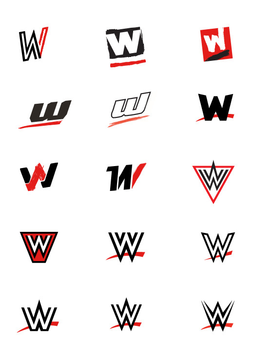 |
|
|
|
Post by Kanenite on Dec 18, 2013 22:37:38 GMT -5
Their current logo is fine and I really hope they don't change it, but if they do, the Network one is probably the best choice.
|
|
|
|
Post by Joe/Smurf on Dec 18, 2013 22:51:37 GMT -5
It's already been revealed to be this one:  |
|
AaronRT
Mid-Carder

Joined on: Oct 17, 2010 18:23:09 GMT -5
Posts: 266
|
Post by AaronRT on Dec 18, 2013 22:54:34 GMT -5
I remember when this fan-made logo was circulating the web. I'd love to see something like this. Something that you know.. has an E in it.  |
|
|
|
Post by BCizzle on Dec 18, 2013 23:03:58 GMT -5
I think it should look like this.  |
|
Mr Wrestling Jr.
Main Eventer
Joined on: Sept 6, 2010 7:07:35 GMT -5
Posts: 3,410
|
Post by Mr Wrestling Jr. on Dec 18, 2013 23:06:25 GMT -5
As long as they don't change the all the Titles to fit with the new logo I'm fine with that.
|
|
|
|
Post by el torro on Dec 18, 2013 23:09:06 GMT -5
I love the one all the way down in the left corner on that picture above.
|
|
|
|
Post by JTG on Dec 18, 2013 23:40:40 GMT -5
I'm not really against a new logo, but I fear it could shake the branding of the company considering the scratch logo is synonymous with WWE. If you look at a lot of the top brands in the world, their logos change over time but never drastically. If they change it, it really ought to be for something similar enough that people will realize it's still WWE straight away.
|
|
|
|
Post by Ian from 616Entertainment. on Dec 19, 2013 0:00:21 GMT -5
Been ready for a new logo for a long time.
Of course I'm not a big fan of the one they chose. =/
|
|
|
|
Post by Duck Holliday on Dec 19, 2013 0:00:37 GMT -5
I think it's time for a change... the scratch logo had a good run and was good looking for it's era, but it's never looked right without the "F" so I think a change is fine.
|
|
|
|
Post by Kanenite on Dec 19, 2013 2:39:14 GMT -5
The logo doesn't look TOO bad against a White background and with black W's. 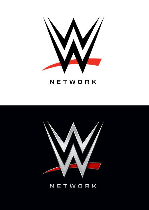 |
|
|
|
Post by skribbel24 on Dec 19, 2013 5:46:54 GMT -5
They better add an E there somewhere. Non wrestling fans look at it as "WW" or just simply "W" which sounds stupid.
|
|
|
|
Post by Flair Forever on Dec 19, 2013 5:53:24 GMT -5
So then the new "WWE World Heavyweight Championship" Belt will already be outdated.... since the entire front is based on the old logo.....
|
|
|
|
Post by ztj_wwf on Dec 19, 2013 5:59:11 GMT -5
Thank God. The current WWE logo has been around way too long.
|
|
|
|
Post by Edge618 on Dec 19, 2013 8:51:52 GMT -5
Non wrestling watching people always say " so you watch WW.....what is it now" . Add a damn E.
|
|
Deleted
Joined on: May 6, 2024 19:52:57 GMT -5
Posts: 0
|
Post by Deleted on Dec 19, 2013 9:03:40 GMT -5
Non wrestling watching people always say " so you watch WW.....what is it now" . Add a damn E.  |
|