|
|
Post by [x] TEXACIDE [x] on Jul 31, 2008 16:54:48 GMT -5
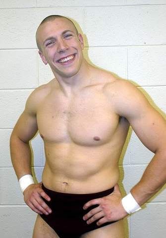
Check out my newest custom and if you want to order something just send me a PM. Thanks for looking, enjoy!The Rock cgi.EBAY LINK NOT ALLOWED/ws/eBayISAPI.dll?ViewItem&item=270261422618    cgi.EBAY cgi.EBAY LINK NOT ALLOWED/ws/eBayISAPI.dll?ViewItem&item=270261179323 Bryan Danielson   |
|
|
|
Post by NYdream™ on Jul 31, 2008 17:02:46 GMT -5
This is a nice clean custom. The attire and body parts choices is perfect. The painting is smooth. But I dont think that head works. But for an ebay custom it is ok. The hair looks a lil odd but the sculpting and modding is smooth no doubt. Good job Tex!
|
|
|
|
Post by dave10009 on Jul 31, 2008 17:43:55 GMT -5
i agree the head doesnt go i give it a 9/10 great work and i love the rd its like the same color as brian
|
|
|
|
Post by mck on Jul 31, 2008 17:47:34 GMT -5
I like everything except the head. That Matt Striker head really doesn't work for anyone, except maybe Excalibur.
|
|
|
|
Post by SuperDuperDragon on Jul 31, 2008 17:52:33 GMT -5
Like the others said, the head kid of ruins it.
Also, Dragon's kickers are not all red, you gave him black already, but it
doesn't go up enough, it should go up to the end of the kickers.
|
|
PdW2kX
Main Eventer
   
Joined on: Jan 8, 2007 23:34:52 GMT -5
Posts: 4,551
|
Post by PdW2kX on Jul 31, 2008 17:59:04 GMT -5
The head is the only real problem I see with it. Everything else is nice and crisp and clean.
|
|
|
|
Post by [x] TEXACIDE [x] on Jul 31, 2008 18:36:29 GMT -5
Thanks, I was going for his goofy smile he does and his little boy haircut. I think it works for that.
|
|
|
|
Post by perilloboy123 on Jul 31, 2008 18:40:49 GMT -5
The head really hurts the custom's overall look. Not to mention, Danielson's rather pale, and you gave him some tannish-looking skin. On a more positive note, the custom looks really clean and the attire looks decent. I'll give this a 7.5/10. Not bad, but it needs some work.
|
|
|
|
Post by [x] TEXACIDE [x] on Jul 31, 2008 18:46:03 GMT -5
The head really hurts the custom's overall look. Not to mention, Danielson's rather pale, and you gave him some tannish-looking skin. On a more positive note, the custom looks really clean and the attire looks decent. I'll give this a 7.5/10. Not bad, but it needs some work. I used the palest skintone parts around actually, it's just the pics that make it seem darker. |
|
atm.
Main Eventer
    WF 10 Year Member
Joined on: Mar 31, 2008 12:48:07 GMT -5
Posts: 1,371
|
Post by atm. on Jul 31, 2008 18:50:01 GMT -5
I kinda like it Tex. Its simple but effective. The attire is perfect from what I can see, but the head does take away, if you have an extra Ric Flair head, like on of the newer ones, sand of the hair, and that is the best Dragon head IMO.
8/10
|
|
Deleted
Joined on: Nov 17, 2024 22:29:21 GMT -5
Posts: 0
|
Post by Deleted on Jul 31, 2008 20:57:05 GMT -5
I normally like your customs but I'm getting tired of seeing these bad head choices that you put on a good amount of your RA customs. It's nice that you tried something new but it looks almost nothing like Danielson. Thanks, I was going for his goofy smile he does and his little boy haircut. I think it works for that.  Nope, don't see much of a resemblance at all. |
|
|
|
Post by spawnsyxx9 on Jul 31, 2008 21:04:06 GMT -5
It's alright. I like the3 belt though even more. Where did you get that done?
|
|
|
|
Post by [x] TEXACIDE [x] on Aug 1, 2008 13:38:53 GMT -5
I made the belt. Added a Custom Rock, enjoy.
|
|
|
|
Post by heartbreak2008 on Aug 1, 2008 15:04:31 GMT -5
Oh My God! Flawless Rock!
|
|
carlitocool1
Superstar
   11 Ref (UK) 3 Ref (US) !!
Joined on: Feb 1, 2007 3:39:24 GMT -5
Posts: 974 
|
Post by carlitocool1 on Aug 1, 2008 15:18:10 GMT -5
Rock looks awesome - i may bid!!
|
|
|
|
Post by wwe4ever on Aug 1, 2008 18:02:53 GMT -5
I like The Rock. You seem to have perfected his full samoan tattoo. Danielson looks great except for the head. You should have used a modded RA20 Ric Flair head. Although, the painting looks very smooth, as usual.
|
|
*Xx:DAN:xX*
Main Eventer
   
Joined on: Jul 18, 2007 0:26:08 GMT -5
Posts: 1,003
|
Post by *Xx:DAN:xX* on Aug 1, 2008 19:58:36 GMT -5
those are nice i dont like the choice of headscan for Bryan Danielson
|
|
|
|
Post by Wrestlaholic on Aug 2, 2008 12:57:37 GMT -5
I like the Rock, but just think the horns on the back of the shorts are a bit too long, and the wrist tape!! remove it lol. Other than that, awesome custom.
|
|
|
|
Post by Groundswell on Aug 3, 2008 5:52:10 GMT -5
Awesome customs man, Good job.
|
|
|
|
Post by sabuisdaman on Aug 3, 2008 10:24:19 GMT -5
nice clean customs i might buy them
|
|


