Gonzo Customs
Main Eventer

Joined on: Dec 24, 2001 4:51:46 GMT -5
Posts: 4,056
|
Post by Gonzo Customs on Jun 21, 2008 18:15:23 GMT -5
|
|
|
|
Post by Kyle "Rowdy" Busch on Jun 21, 2008 18:47:37 GMT -5
I love Beyondo's Ortiz, the head look's big and weird but it still resembles him, Matt Serra's head looks weird as well but a nice overall figure but im gonna go with Beyondo's Ortiz
|
|
Deleted
Joined on: Sept 30, 2024 0:31:42 GMT -5
Posts: 0
|
Post by Deleted on Jun 21, 2008 18:53:46 GMT -5
It's a close match but I have to go with Beyondo. The modded Kurt Angle works good for Ortiz but I barely see the resemblance with the modded Lashley head for Serra. Both figures have smooth sculpting but the hand painted logos on Ortiz are just amazing.
|
|
Gonzo Customs
Main Eventer
Joined on: Dec 24, 2001 4:51:46 GMT -5
Posts: 4,056
|
Post by Gonzo Customs on Jun 21, 2008 18:54:25 GMT -5
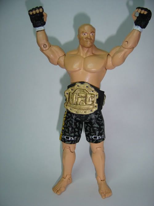
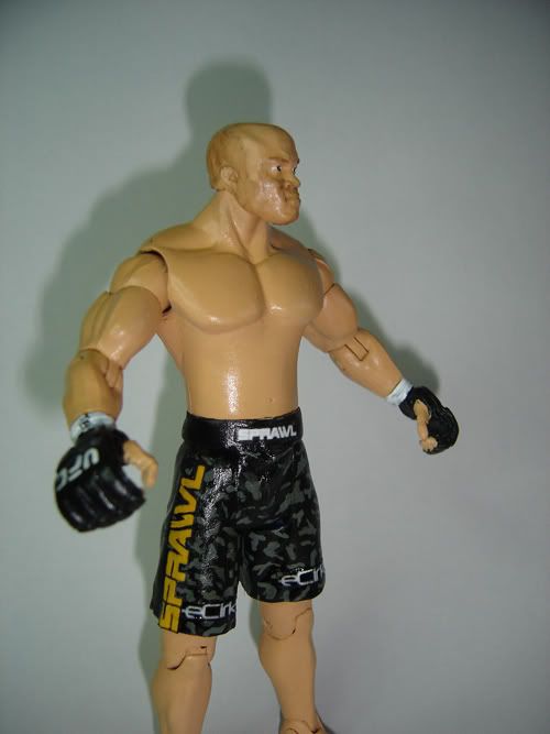
This is an extremely close one in my book.
Matt Serra
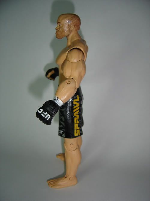
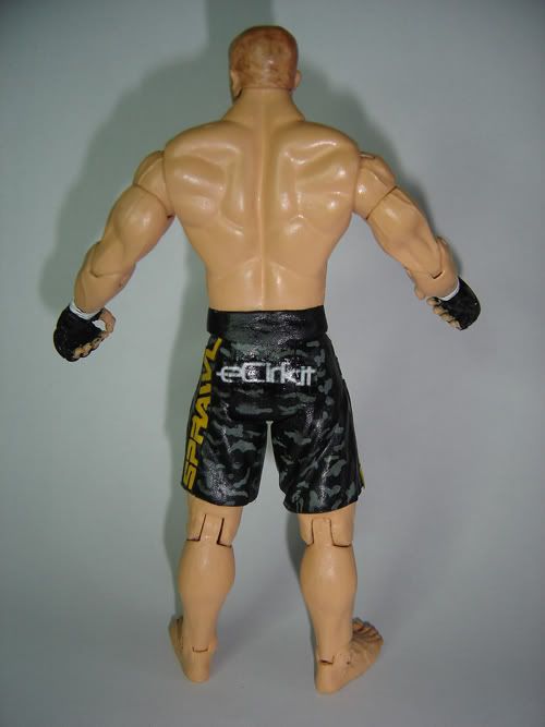
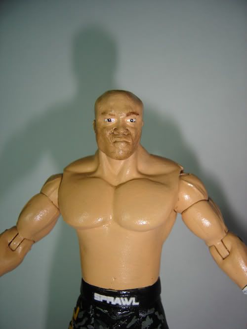
First off the head. You captured his odd head shape well, the painted eyes help it accentuate his look. The stubble hair and 5 o clock shadow both look good. The body and parts are superb. I can see that you used the Cena shorts and transplanted the lower part of the upper leg into the Cena shorts mold. Great job on that. The painting on the shorts is great and the logos look spot on. The only place that looks shakey is the UFC on the gloves.
Tito Ortiz
Starting with the head. I see what you were going for with the wide jaw, the detail on the chin, and even the nose. However I feel the nose is HUGE and shouldn't be. The hair looks good, but the hair line it self doesn't look like Tito's to me. Again, I see what you were going for in the head, but I just don't see Tito in it. Parts choice is superb as well. The Torso works for Tito, but I think more of a cruiser type torso might have worked better, or some sculpting out of the abs. It looks like you sculpted the entire shorts area and it looks grand. The detail in the shorts as well as the paint job and logos look great. Gloves look great as well.
My vote will have to go to HR2X on this one. I feel the head is just a closer resemblence, everything else is too close to call. Although it is great, this is the first custom from Beyondo that didn't blow me away.
|
|
|
|
Post by TxR on Jun 21, 2008 19:48:59 GMT -5
Considering that I haven nothing to do until the TUF Finale, and its only one match I figured I would vote on this one...
I hate to seem anti-climactic, but this match is a really easy one for me to vote on... No suspense with this one, my vote goes to Beyondo. For me its just a much more accurate, detailed and professional looking figure.
HR2X... I like that you went with something different with Matt Serra... I assume its a Long Island thing. I havent seen a Serra figure ever, so its a cool change. I really really like that torso for him. It fits his body at 170 perfectly... beefed up a stalky. Good work there. The ehad does absolutely nothing for me at all. It still looks way too much like Bobby Lashley for me to suspend disbelief and see Serra in it. The head shape is totally off as well. He has sort of a pointed head and the Lashley head is like squared on top. Also the jaw and lips protrude way too much. His facial features still look very black. Almost like a white Anderson Silva or something. Where you modded the face also looks a bit rough and I am not a fan of how the eyes were painted... Not sure what it is, just looks a bit odd.
Moving down, the camo designs on the shorts look good, however on the waist band there is a few strokes of skintone that hit the shorts. Im torn on the decals as well... I always feel that if you are going to put that much effort into your figure you should go the step further and paint it all... Next to Beynodo's handpainted logos it looks very amateur using decals. The gloves are cool. I like that you didnt leave the taped up thumb, but the skintone on it looks rough... Maybe you didnt sand down the texture on the thumbs? The UFC logo looks rushed, so that could use cleaning up, but i like the signed tape around the wrist. Good attention to detail there. Finally... I like the addition of the belt, but a couple things about it bug me... It seems a big large for the frame of the figure, there is no silver detailing on it, and it looks a bit rough. Im not sure if it was sculpted or what, but the lettering especially looks shaky.
Beyondo went with a more tradition choice with Ortiz. Other than Liddell (and recently Kimbo) he is definitely the most customized MMA fighter, however none have been made this well... I personally cannot stand Ortiz, but I wont let that skew my voting. I like the head on this one... Looks like the later Angle scan, but its modded very well. Its huge yes, but Tito does have a humongous dome. I like the mods that you made to the face in the nose and chin areas, but it makes the head look a bit cartoony. Also, the painting of the pupils on the eyes while nicely done is a little too large and has an anime kind of look. The rest of this figure is absolutely tremendous. I like the torso that you used for this. Most I have seen use the HW or cruiser torso neither of which I care for. You could have sculpted over some of the definition in the abs, particularly on the sides, but thats no problem for me. Arms are a nice choice. Gloves look very nice. Im impressed with the painted logos. Moving down, the sculpting on the shorts is excellent. The waistband especially tickles my fancy. Exception painting on those shorts. Everything form the flames to the sponsor logos are truly spot on. The gradient effect you did on those flames looks lifelike.. thats amazing. All of the lettering on the logos and the barcodes on the Xyience symbol are magnificent. Things like the tattoos which look very realisitc, the painted on logos, and the clean facial modifications make this figure stand out far beyond HR2X's Serra. Couldnt have asked for any more... One hell of a figure.
Good work gentlemen, but Beyondo definitely keeps his title.
|
|
|
|
Post by Nelly - The Belt Guy on Jun 21, 2008 20:06:09 GMT -5
Serra - I like him a lot. His odd looking head works really well. i like the paint job on the shorts. The face looks a bit off like he had reconstructive surgery or he was in a fight. the belt is a nice touch.
Ortiz - You captured him very very well. The attire and the head is awesome. I've seen Ortiz live in person and he has a freaking huge head (ran into him in Vegas). The tattoo work is also very good, faint, but still there. Nice work.
Both put on solid efforts and it was a close one, but in the end i'm going to have to go with Beyondo with the Ortiz. That head works for him.
|
|
|
|
Post by [x] TEXACIDE [x] on Jun 21, 2008 20:30:52 GMT -5
Both of these customs are really neat and it's cool to see different stuff but that Ortiz is perfect, I love it. My vote goes to Beyondo, you never fail to impress. The head choice and mods are perfect for his big noggin and all of the sculpted else where is top notch as always. Smooth painting all around, real clean job on the flames and logos on Tito's shorts. It's one of my favorite figures in recent memory.
HR2X, that Serra figure is nicely done as well, there is no taking away form your talent as I like this figure too and the belt is a nice touch but it just wasn't your night.
Cool match guys. Good job.
|
|
|
|
Post by b13stinga on Jun 21, 2008 20:39:12 GMT -5
both were great customs great job it was a close match
|
|
|
|
Post by HR2X on Jun 21, 2008 20:42:13 GMT -5
Considering that I haven nothing to do until the TUF Finale, and its only one match I figured I would vote on this one... I hate to seem anti-climactic, but this match is a really easy one for me to vote on... No suspense with this one, my vote goes to Beyondo. For me its just a much more accurate, detailed and professional looking figure. HR2X... I like that you went with something different with Matt Serra... I assume its a Long Island thing. I havent seen a Serra figure ever, so its a cool change. I really really like that torso for him. It fits his body at 170 perfectly... beefed up a stalky. Good work there. The ehad does absolutely nothing for me at all. It still looks way too much like Bobby Lashley for me to suspend disbelief and see Serra in it. The head shape is totally off as well. He has sort of a pointed head and the Lashley head is like squared on top. Also the jaw and lips protrude way too much. His facial features still look very black. Almost like a white Anderson Silva or something. Where you modded the face also looks a bit rough and I am not a fan of how the eyes were painted... Not sure what it is, just looks a bit odd. Moving down, the camo designs on the shorts look good, however on the waist band there is a few strokes of skintone that hit the shorts. Im torn on the decals as well... I always feel that if you are going to put that much effort into your figure you should go the step further and paint it all... Next to Beynodo's handpainted logos it looks very amateur using decals. The gloves are cool. I like that you didnt leave the taped up thumb, but the skintone on it looks rough... Maybe you didnt sand down the texture on the thumbs? The UFC logo looks rushed, so that could use cleaning up, but i like the signed tape around the wrist. Good attention to detail there. Finally... I like the addition of the belt, but a couple things about it bug me... It seems a big large for the frame of the figure, there is no silver detailing on it, and it looks a bit rough. Im not sure if it was sculpted or what, but the lettering especially looks shaky. Beyondo went with a more tradition choice with Ortiz. Other than Liddell (and recently Kimbo) he is definitely the most customized MMA fighter, however none have been made this well... I personally cannot stand Ortiz, but I wont let that skew my voting. I like the head on this one... Looks like the later Angle scan, but its modded very well. Its huge yes, but Tito does have a humongous dome. I like the mods that you made to the face in the nose and chin areas, but it makes the head look a bit cartoony. Also, the painting of the pupils on the eyes while nicely done is a little too large and has an anime kind of look. The rest of this figure is absolutely tremendous. I like the torso that you used for this. Most I have seen use the HW or cruiser torso neither of which I care for. You could have sculpted over some of the definition in the abs, particularly on the sides, but thats no problem for me. Arms are a nice choice. Gloves look very nice. Im impressed with the painted logos. Moving down, the sculpting on the shorts is excellent. The waistband especially tickles my fancy. Exception painting on those shorts. Everything form the flames to the sponsor logos are truly spot on. The gradient effect you did on those flames looks lifelike.. thats amazing. All of the lettering on the logos and the barcodes on the Xyience symbol are magnificent. Things like the tattoos which look very realisitc, the painted on logos, and the clean facial modifications make this figure stand out far beyond HR2X's Serra. Couldnt have asked for any more... One hell of a figure. Good work gentlemen, but Beyondo definitely keeps his title. Just to clarify, I actually repainted over the Sprawl logos on the side since they didn't come out the right color. |
|
|
|
Post by NYdream™ on Jun 21, 2008 20:52:12 GMT -5
HR2X- This one is good... It has some major flaws IMO... For starters the tape around the gloves was not painted on properly... looks a bit sloppy.... and the head really kills it... bad choice and modding IMO cus it is kind of sloppy........ But it also has some plus's... the skintone and shorts are great.... nothing wrong there... and the belt is a nice plus
Beyondo- This is a great figure it has flaws... but less than the Sera.... The head choice was ok and it works... but not that well... thats really the only flaw.... other than that everything is perfect.... the attire is good... skintone is aazinf... and it is not the least bit sloppy... very smooth....
great job to both of you but im gonnna have to go with Beyondo on this one
|
|
|
|
Post by Classic Collector: The Return on Jun 21, 2008 20:58:23 GMT -5
Why is this even really a match ? That Serra looks like someone whipped their butt on his face haha. Beyondo is still champion.
|
|
|
|
Post by NYdream™ on Jun 21, 2008 21:02:11 GMT -5
Why is this even really a match ? That Serra looks like someone whipped their butt on his face haha. Beyondo is still champion. because Beyondo laid out an open challange and HR2X accepted |
|
|
|
Post by Titantrap: Gold Club Veteran on Jun 21, 2008 21:08:17 GMT -5
Since i despise MMA and have never even heard of Matt Serra, i'll go purely on quality here.
Serra: Printouts are a big no-no at this level of the game. I saw the comment that you did paint over the side one, which is fine, but the one on the band of the shorts is painfully obvious. The head modding is very rough, the painted stubble looks more like his face is dirty that a five o'clock shadow. On the positive side, the torso mod is excellent, very smooth and realistic, the skintone is very good (i am always big on a well painted skintone). The untaped thumb is a nice addition as well.
Tito: The head is very, very cartoony. It looks like a proto for "Tito Ortiz Rock 'n' MMA" Saturday morning cartoon show. I also hate the partial posed aspect of the shorts, just a bad concept. Pick one, posed or not posed. Positives are many, while head is cartoony, it does capture Tito and his ridiculously large noggin pretty well. The logos on the trunks are practically flawless, i really love the blending on the fire. Overall, it is a very smooth, professional looking figure. Smooth and well thought out.
Winner: Beyondo retains in a close match, but i will say this is my least favorite Beyondo custom by far.
|
|
|
|
Post by HR2X on Jun 21, 2008 22:07:45 GMT -5
I don't know where you guys think I modded the head, but I didn't. If you're going to blame anyone for it being rough, blame Jakks.
|
|
|
|
Post by pimpmaster5000 on Jun 21, 2008 22:26:39 GMT -5
I don't know where you guys think I modded the head, but I didn't. If you're going to blame anyone for it being rough, blame Jakks. look at were the lip and nose are there is a smudge in the paint that looks as if you have use some clay to modd it because of the finger print |
|
|
|
Post by NYdream™ on Jun 21, 2008 22:26:55 GMT -5
I don't know where you guys think I modded the head, but I didn't. If you're going to blame anyone for it being rough, blame Jakks. well before you used it it wasnt rough looking... so we cant blame jakks.... so maybe i is the paint... might be a lil sloppy but the head dont look right... |
|
plasticsuperstar
Main Eventer
Joined on: Dec 27, 2006 12:58:06 GMT -5
Posts: 4,085
|
Post by plasticsuperstar on Jun 21, 2008 22:28:56 GMT -5
The Tito Ortiz is clearly alot better, the only problem with it is the knee and ankle joints, they should've been sculpted over as the fixed hips make those joints redundant. The waist upwards still benefits from the articulation so I prefer that that's still there. The sculpting on the shorts looks superb as does the painting, the logos and text on the shorts does look a bit hand drawn which wouldn't suit a regular RA figure but because of the cartoony look of the figure it actually adds to it having hand painted logos. I really like the cartoony style of the head, it's a perfect slightly charicatured likeness of Tito, it actually matches the body style better than a more realistic head, especially with the large chunky gloved hands. If the knees and ankles were sculpted over it would be a perfect custom, even still it's very close.
I don't like the Matt Serra at all really, it looks awkward and messy, especially the head which is lumpy and uneven. The torso looks good both with the modding and the painting but that's the only section that looks perfect. One leg of the shorts is longer than the other. The wristape paint needs redoing but the logos on the gloves look good. I like the logos on the shorts, some people don't like decals but as long as they are done right they will always give a more professional look when it comes to computer graphic designs. Nice attempt at a belt, it looks good but very homemade, as does the whole figure.
|
|
CMD
POSSIBLE BAD TRADER
Joined on: Apr 16, 2003 0:08:57 GMT -5
Posts: 5,666
|
Post by CMD on Jun 21, 2008 22:30:11 GMT -5
I'm going with Beyondo. I'm going by how clean the figures look as I know absolutely nothing about either of these guys (I'm aware of Tito Ortiz's existance, never heard of the other guy. Reference pics would have helped). The details on Beyondo's figure look much more crisp and neat, the eyes on HR2X's figure look very weird. So, I'm going with Beyondo.
-CMD
|
|
|
|
Post by HR2X on Jun 21, 2008 22:49:41 GMT -5
|
|
|
|
Post by NYdream™ on Jun 21, 2008 23:41:16 GMT -5
Since you asked for ref pics... Tito Ortiz:   Matt Serra:    HR2X should have made the head more pointy looking like in the ref pics.... and the nose is too fat... should have been modded.... Great job no doubt HR. but overall Beyondo won.... |
|


![[x] TEXACIDE [x] Avatar](http://i42.tinypic.com/2kj7a1.png)