|
|
Post by duan on May 26, 2008 22:24:31 GMT -5
World Photoshop Federation Presents:
Domination: "The Photo Album" CardDate: May 26th 2008 Live From: Oklahoma City, Oklahoma Dark Match:Contract MatchBrady vs. TorontierStip: Anyone Brady: C Torontier: C Torontier: C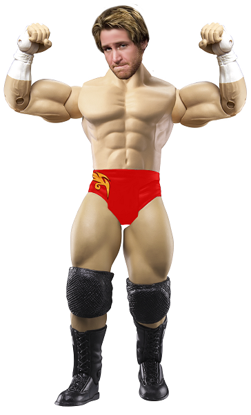 Duan Vote: Duan Vote: Both are pretty brutal. Was hard to pick because both have some major flaws, but I think I'll go Torontier. His tones might not match, but his head is still better. Sub Attractions:Phoenix vs. Bret vs. BDTTKStip: Chainsaw Charlie Phoenix: B+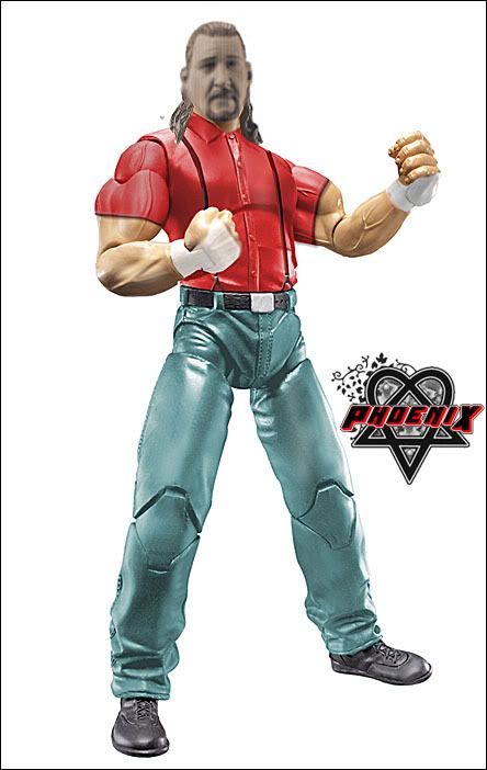 Bret: A Bret: A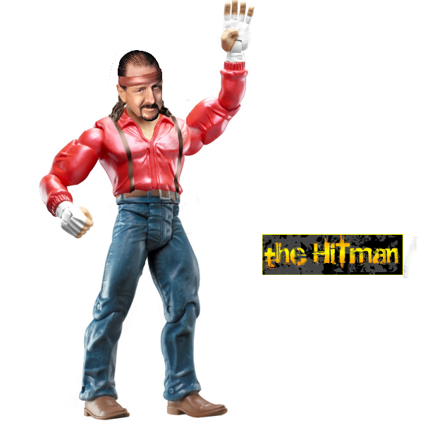 BDTTK: B+ BDTTK: B+ Duan Vote: Duan Vote: Gotta go with Bret here. Did a wonderful job on the head and all 3 attires look well. Phoenix also did awesome and so did BDTTK. Excellent match boys. Double B vs. SpencerStip: Linda McMahon Double B: B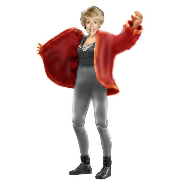 Spencer: C+ Spencer: C+ Duan Vote: Duan Vote: This stip was very hard and I'm sorry for giving it. I think BB did a better job and he deserves my vote. The Corporation vs. Triple M/Teh GameStip: Any Hollywood Power Couple (ex; Brad Pitt/Angelina Jolie) Corporation wins by DQ! Triple M doesn't lose. 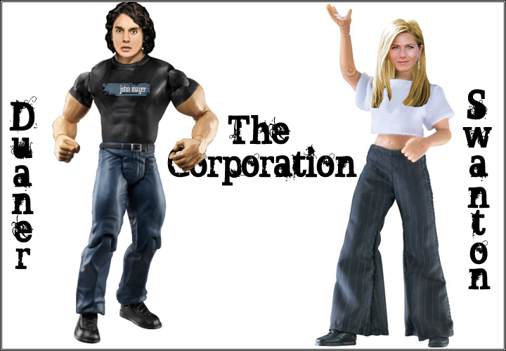  Cass vs. DielawnStip: Cass vs. DielawnStip: Any X Division Superstar Cass: B+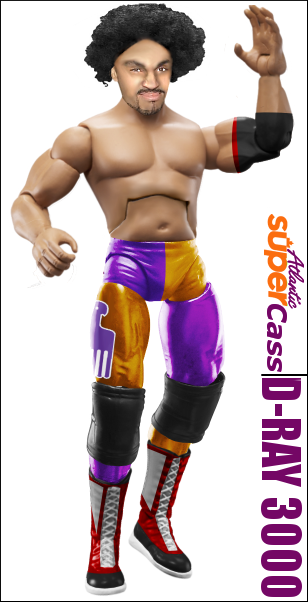 Dielawn: A Dielawn: A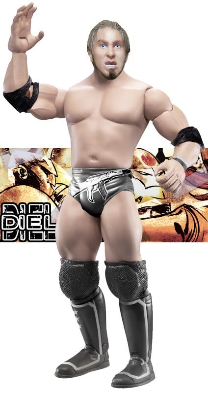 Duan Vote: Duan Vote: Very close stip and I almost went Cass here, but the hair on his figure brings it down. Dielawn does an awesome job here. Good match. Main Attraction: WPF World ChampionshipGazza (c) vs. MJHStip: Any Leader of a Stable MJH: A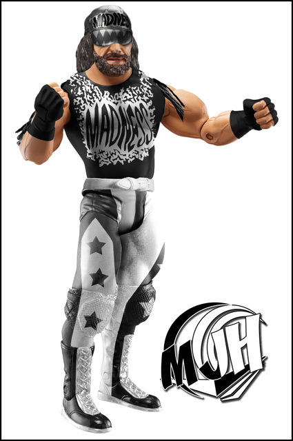 Gazza: A Gazza: A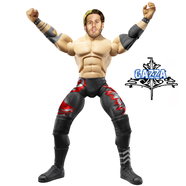 Duan Vote: Duan Vote: VERY VERY CLOSE MATCH AGAIN! I couldn't chose until I really looked at them and MJH gets my vote. Awesome attire and head is spot on. Good work. NR, NV. Ends tomorrow sometime. |
|
|
|
Post by .:xx Double_B xx:. on May 26, 2008 23:29:08 GMT -5
wow my fig sucks, and thanks for apoligizing, cause it was hard to make.
Now to voting:
Torontier: wow, both are about the same level, but im going to go with torontier because of his head and the attire is better. little tip, the joints have to be darker to make it seam like a natural repaint.
Bret: WOW! Great match, but the others heads dont match their body, and hitmans is phenomenal.
Dielawn: another great match but dielawns head is amazing and attire is good too. Cass, you did great too though!
MJH: Best match probably, but MJH gets my vote for his attire, gazza, thats probably your best fig. (except for your steiner.)
|
|
|
|
Post by bowdowntotheking on May 27, 2008 0:31:10 GMT -5
Torontier-cleaner figure and better shaped head
Spencer- watts with bb's lower body
Dielawn-Great head and perfect figure
MJH- him and dielawn are the two bets figs of the week nough said
|
|
|
|
Post by sycho1warrior on May 27, 2008 1:20:19 GMT -5
Torontier: Figure looks cleaner, the head looks better even though its at a bad angle.
Bret: The figure is better then the other two, the head and attire have a sharper look to them, unlike the others who's attires a dull, Phoenix's attire is to bad but the head brings it down, and BDTTK's head looks to smudge/blurred.
Dielawn: Great head, really clean good looking figure, Cass was close to getting my vote but the har brings it down.
MJH: Awesome, attire is perfect in opinion, the hair and beard are very figure looking, its an overall great igure, Gazza's was equally as great but tones on the body/head seem to be a bit off, still a great figure.
|
|
|
|
Post by brethitmanhart on May 27, 2008 4:21:50 GMT -5
Torontier: Both aren't really the best but his is better. The others head looks very squashed and blurry.
Spencer: Double B's head is much better but the legs and lower body really lets it down. It looks very blurry and discoloured.
Dielawn - Head is awesome. Really wins the match. Attires on both of the figures are really sweet. Cass' attire looks very sharp and accurate. I just think it's the afro that lets it down. D's machine gun on the trunks is brilliant. Good match guys.
MJH - The BOTW. It's brilliant. Flawless really. Love the Logo's on the shirt, I can really see how long it really must of taken to do it. Gazza's is nice, the head is really good and the attire is decent.
BOTW
MJH
Dielawn
|
|
Nexus Leader
Superstar

Joined on: Jan 30, 2007 13:57:04 GMT -5
Posts: 861
|
Post by Nexus Leader on May 27, 2008 5:31:53 GMT -5
Brandy: The head is better and the tones match more
Bret: Better attire and head, whats up with all the other heads they look smduged quite alot and phoniex why yours got lines lol?
Double B: Dint really like any of them but the attire andhead is better for Double B
Dielawn: Great figure better than last weeks the attire and the whole figure is flawless
MJH: I thnk we have a new champion, something about Gazzas head puts me off, i think its the skintone
|
|
Deleted
Joined on: Oct 5, 2024 18:18:46 GMT -5
Posts: 0
|
Post by Deleted on May 27, 2008 6:03:25 GMT -5
Brady - Attire is better and toronterereerer's tones are off.
Bret - Very close match. But bret has the better head.
Spencer - Better head. BB's is over blurred.
Cass - More work done. Attire is awesome. Head looks awesome.
Gazza - I like it more. Attire is amazing.
BOTW
Gazza
Cass
|
|
|
|
Post by PhoeniX™: Valoween on May 27, 2008 7:13:29 GMT -5
Brandy: The head is better and the tones match more Bret: Better attire and head, whats up with all the other heads they look smduged quite alot and phoniex why yours got lines lol? Double B: Dint really like any of them but the attire andhead is better for Double B Dielawn: Great figure better than last weeks the attire and the whole figure is flawless MJH: I thnk we have a new champion, something about Gazzas head puts me off, i think its the skintone My head has lines because Chainsaw Charlie wore pantyhose on his head. Thats why the head is brown, smudged and has lines on. |
|
Joliet Jake
Superstar
Ya see, me and the Lord have an understanding.
Joined on: Apr 25, 2007 14:11:00 GMT -5
Posts: 738
|
Post by Joliet Jake on May 27, 2008 7:17:59 GMT -5
Torontier: The Figure is the cleaner out of the two. Work on getting your skin tones to match. The head has more red tones and the body has more yellow tones... try to find a middle ground or add more yellow tones to the haad using the color balance tool.
Hitman: I really like the attire and you kept it consistent to what Chainsaw actually wore. It would have been cool to see yo try putting pantyhose over his head but i realize thats pretty friggin difficult.
Spencer: Better figure overall. Much more crisp and natural looking. Plus the head looks more figure like. Bboy did too much blurring.
Nice figure Duaner... the head is very good.
Dielawn: One of the best figures this week. Attire looks fantastic as well as the modded figure head and torso choice. I can't find any flaws in this one.
MJH: One of the best figures this week as well.. in fact my favorite of the week. Another flawless figure, the head mod is insane! The attire is amazing... absolutely incredible.
BOTW: Dielawn & MJH
|
|
|
|
Post by Gazza on May 27, 2008 11:41:31 GMT -5
Brady- At first i thought Toroniter, but after looking at the figures again. The tones not matching and him not having Kickpads, lets it down. Bret- The attire is good, and the head looks great. Phoenix also did a great job. Spencer- BBoys is wayyyyyyyyyyyyyyy to smuged. Cass- Both are awesome figures, but i dont know if its just my laptop but Dielawns looks like its seen a ghost, the tone is way to white. So much for me doing well recently.  |
|
|
|
Post by Gazza on May 27, 2008 12:00:39 GMT -5
Torontier-cleaner figure and better shaped head Spencer- watts with bb's lower body Dielawn-Great head and perfect figure MJH- him and dielawn are the two bets figs of the week nough saidWhy can't some people type out reasons for their vote instead of craplike that?  |
|
|
|
Post by jomoishollywood on May 27, 2008 12:44:49 GMT -5
Torontier-cleaner figure and better shaped head Spencer- watts with bb's lower body Dielawn-Great head and perfect figure MJH- him and dielawn are the two bets figs of the week nough saidWhy can't some people type out reasons for their vote instead of **** like that? If people like a figure, they like a figure. Reasons arent even needed, imo. |
|
|
|
Post by Gazza on May 27, 2008 12:48:18 GMT -5
Why can't some people type out reasons for their vote instead of **** like that? If people like a figure, they like a figure. Reasons arent even needed, imo. "No Reason,No Vote" And its not a proper reason. Without a reason, it would be worse. Because the person dosnt know whats wrong/right with there figure.,tbh. |
|
|
|
Post by Cass on May 27, 2008 12:49:45 GMT -5
Brady - his figure has more effort, as he tried doing a modded head and made the accurate attire and tones match better. Sabin also worse kickpads, so brady gets accuracy.
Phoenix - i would have went with bdttk here but, he lacked on the pantyhose over the head thing, it wouldn't just cover his face, his hair would be under it too, plus the shirt is too pink. I see tons of flaws in Bret's that turn me off, like the lack of pantyhose head, he didn't wear a coat, or long sleeves for that matter and the head is the same size as the torso. Phoenix's is pretty near perfect as he did the smart thing and cut off the hair to look squished under.
Spencer - I'm sorry but i don't think i ever seen Linda McMahon in tights or have a blurred crotch for that matter. Spencer gets the vote based on the cleanness of the figure. B-boy's is WAY too blurry to even consider for the vote.
Gazza - Probably the best head he has ever done, aswell as I'm proud of the way he does his attires now, they look less sloppy as they use to be, the designs are great as well. darken the pads a bit more though. MJH's white on the black is too contrasted on the legs or over sharpened. And the tassels have no shadow and get a straight cut-off.
|
|
|
|
Post by PhoeniX™: Valoween on May 27, 2008 13:13:46 GMT -5
Brady vs. Torontier: Mike...I mean Torontier put a logo directly on a joint. Brady did more work, even though he didn't do briliantly, I like it better than Torontier's. MY VOTE: BRADY
Double B vs. Spencer: ...how the hell did Double B's figure rank higher?! Look at the trousers, its such a mess. Spencer's head looks more plastic. Double B's attire is just blurry and poorly executed. MY VOTE: SPENCER
Cass vs. Dielawn: Both very good figures. But Sabin is far too pale, and the logo goes over the joints. The right forearm is choppy too. The head, albeit very good, is inaccurate foe the time period of the attire. I love the colours on Cass's, and the torso edit is very good. MY VOTE: CASS
Gazza (c) vs. MJH: I love both figures. The Shelley head is really good, and the designs are amazingly executed. But I also really enjoy the Macho Man. This is a very hard choice for me. I guess I will got for Gaz. Cass is right about MJH's been over-contrasted and sharpened. MY VOTE: GAZZA
|
|
|
|
Post by cjs. on May 27, 2008 13:15:52 GMT -5
Torontier - I don't like Brady's triangle head to much.
Phoenix - The attire is excellent, the only think I don't like is the
head, I think maybe plastic wrap would've worked better in that situation.
Spencer - His head isn't great, but looks better edited and the attire seems something more like what Linda would wear.
(Duaner nice figure, I just don't like the head much. Swanton you've done much better. Triple M I think this is your best, good work.)
Dielawn - Cass' figure is good, probably one of his best but Dielawn's back and basicly flawless as usual. Great head and the only thing I don't like is the overall skintone but I haven't seen him so I'm not sure if it's accurate or not.
MJH - Gazza that is probably your best but it's not quite as good as MJH's (which imo is one of the best PS figures to date)
BOTW is MJH.
|
|
Mattie!
Main Eventer
@MattieHH5000
Joined on: Apr 21, 2006 15:30:11 GMT -5
Posts: 2,992
|
Post by Mattie! on May 27, 2008 13:24:10 GMT -5
Brady - his figs attire is more like sabins and has put more effort into the figure
Bret - the attire is dead on well all of them are but his one sticks out the most in my opinion i like the creative use of the CSTT shirts.
Spencer - i like the use of the rocky figure in my opinion it goes quiet well for linda.
Dielawn - i love the designs used on the trunks of the figure!
Gazza- the shelley is one of my faveorite figures ive seen while being involved of photoshopping the designs and head are dead on!
|
|
imdielawn
Main Eventer
watch.imdielawn.com
Joined on: Jul 16, 2003 10:42:29 GMT -5
Posts: 1,864
|
Post by imdielawn on May 27, 2008 13:25:22 GMT -5
Cass vs. Dielawn: Both very good figures. But Sabin is far too pale, and the logo goes over the joints. The right forearm is choppy too. The head, albeit very good, is inaccurate foe the time period of the attire. I love the colours on Cass's, and the torso edit is very good. MY VOTE: CASSI don't see where the logo goes over the joints, and how is the head not correct for the time period of the attire?  |
|
|
|
Post by PhoeniX™: Valoween on May 27, 2008 13:31:07 GMT -5
Cass vs. Dielawn: Both very good figures. But Sabin is far too pale, and the logo goes over the joints. The right forearm is choppy too. The head, albeit very good, is inaccurate foe the time period of the attire. I love the colours on Cass's, and the torso edit is very good. MY VOTE: CASSI don't see where the logo goes over the joints, and how is the head not correct for the time period of the attire? ...judging by that pic, the hair is totally wrong. And he hasn't had the chinstrap beard for a very long time. Compare that pic to your figure. Inaccurate. I rest my case. |
|
|
|
Post by Cass on May 27, 2008 13:32:16 GMT -5
in that case  there is nothing wrong with my hair |
|