CWE OWNER
Main Eventer
 2015
2015
Joined on: Oct 1, 2005 20:47:13 GMT -5
Posts: 2,884
|
Post by CWE OWNER on Jul 7, 2020 18:34:43 GMT -5
Lets face it it had a very hard chance in looking better than the original. As imo it was the best title in the current era. But yeah i'm on the fence with it tbh.
|
|
|
|
Post by RuthlessFigs on Jul 7, 2020 18:44:42 GMT -5
I like it.
I prefer the old design, but this is pretty good, and it's not a straight copy of another active Title so that's a plus.
It could use some improvements, mainly with the font. If they made it all the same size, or even just made the 'Champion' smaller & 'United States' bigger, it'd look better.
Also, correct me if i'm wrong, but the old Untied States Title was the longest tenured Title design in WWE History at 17 years.
|
|
|
|
Post by RuthlessFigs on Jul 7, 2020 18:49:08 GMT -5
And not to forget, the eagle has been a prominent part of many belt designs in WWE history, a lot of those being some of the most popular designs. I don't have the picture, but there was a rejected re-design for the WWE title (when Rock retired the spinner belt) where there was an eagle flying out of the title that looked really cool. I totally agree with the eagle being important to WWE history. I just think it's overkill on this one.  |
|
|
|
Post by Valbroski on Jul 7, 2020 19:00:31 GMT -5
I'm not a fan.
|
|
|
|
Post by ~ Cymru ~ on Jul 7, 2020 20:20:34 GMT -5
I don't have the picture, but there was a rejected re-design for the WWE title (when Rock retired the spinner belt) where there was an eagle flying out of the title that looked really cool. I totally agree with the eagle being important to WWE history. I just think it's overkill on this one. Man I remember this doing the rounds, what a beast of a belt. Its a shame they didn't do something like this with a crow for Bray when he had his silly mask cummerbund belt. I do like the US title upgrade, I don't know if that's a biased opinion as I expected it to be utter trash like all the other titles. I still can't bring myself to look at the IC title properly. |
|
|
|
Post by marino13 on Jul 7, 2020 20:51:08 GMT -5
The only thing I wish they had done differently is I wish there was blue on top behind the stars... 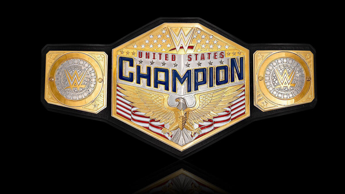 Besides that, I dig it. I will say, I liked the old design and didn't feel a change was overly important. So it'll take time to get used to it. |
|
|
|
Post by drifter on Jul 7, 2020 21:31:18 GMT -5
The only thing I wish they had done differently is I wish there was blue on top behind the stars... Besides that, I dig it. I will say, I liked the old design and didn't feel a change was overly important. So it'll take time to get used to it. I think I would have done, like you said, adding the blue, move and scale down the size of the word CHAMPION to the bottom of the plate, raise the eagle up, to right under UNITED STATES, and add the map design of the United States under the eagle. |
|
|
|
Post by GreyHaze:Big Bad Booty Daddy on Jul 7, 2020 22:06:20 GMT -5
Not sure what to think of it. I don’t like the shape of the main plate or the over exaggerated font. However, at least it’s not that ugly main championship plate.
|
|
|
|
Post by greenjack1992 on Jul 8, 2020 3:42:42 GMT -5
It's absolutely horrible. Why does it need such MASSIVE lettering?
|
|
|
|
Post by Yambag Jones on Jul 8, 2020 6:21:32 GMT -5
I don't have the picture, but there was a rejected re-design for the WWE title (when Rock retired the spinner belt) where there was an eagle flying out of the title that looked really cool. I totally agree with the eagle being important to WWE history. I just think it's overkill on this one. Thanks, man! |
|
|
|
Post by LK3 on Jul 8, 2020 6:28:29 GMT -5
The only thing I wish they had done differently is I wish there was blue on top behind the stars... Besides that, I dig it. I will say, I liked the old design and didn't feel a change was overly important. So it'll take time to get used to it. Yeah, it could definitely use some more blue. I also realized that I do not like the C and N being bigger than the rest of the word in champion. |
|
Deleted
Joined on: Apr 24, 2024 2:20:11 GMT -5
Posts: 0
|
Post by Deleted on Jul 8, 2020 9:19:35 GMT -5
Doesn't matter to me, I'll never win the  ing thing. |
|
|
|
Post by Yambag Jones on Jul 8, 2020 12:54:50 GMT -5
This I do genuinely feel is an improvement.  |
|
Biff Slamkovich™
Main Eventer
WF 10+ Year Member
Joined on: Nov 21, 2009 22:53:58 GMT -5
Posts: 3,590
|
Post by Biff Slamkovich™ on Jul 8, 2020 15:49:46 GMT -5
Not a fan. A bit too bland in my opinion and just an overall misfire.
The eagle being added in I will give credit for.
|
|
|
|
Post by Nick Papagiorgio on Jul 8, 2020 16:17:38 GMT -5
Saw this video on twitter, this is how the main plate was made.
This belt was made and finished in late December.
|
|
|
|
Post by McBlake on Jul 8, 2020 16:59:58 GMT -5
This I do genuinely feel is an improvement. Seeing this actually makes me dislike the redesign 😳 What could have been... |
|
|
|
Post by Rated [R] NinJa on Jul 8, 2020 17:25:36 GMT -5
This I do genuinely feel is an improvement. God, that is so much better... |
|
|
|
Post by greenjack1992 on Jul 8, 2020 17:59:34 GMT -5
This I do genuinely feel is an improvement. That is significantly better. The lettering is still too large, but it's better than what WWE has done. |
|
|
|
Post by JC Motors on Jul 8, 2020 18:11:38 GMT -5
It was time for a new design. The old belt was way outdated
|
|
|
|
Post by TheHitmanKid on Jul 8, 2020 20:19:42 GMT -5
I don't have the picture, but there was a rejected re-design for the WWE title (when Rock retired the spinner belt) where there was an eagle flying out of the title that looked really cool. I totally agree with the eagle being important to WWE history. I just think it's overkill on this one. I really love the look of this belt for some reason. |
|


![Rated [R] NinJa Avatar](http://storage.proboards.com/530008/avatar/IDIYNeRTVZulhCPXFiqx.png)