Post by becca on Feb 8, 2009 17:06:34 GMT -5
Top 4:
Gate: Logo is ridiculous. Sculpting is really good, though I'm not completely convinced by the wrinkles on the back. Head is a bit small, but the face choice is era-appropriate.
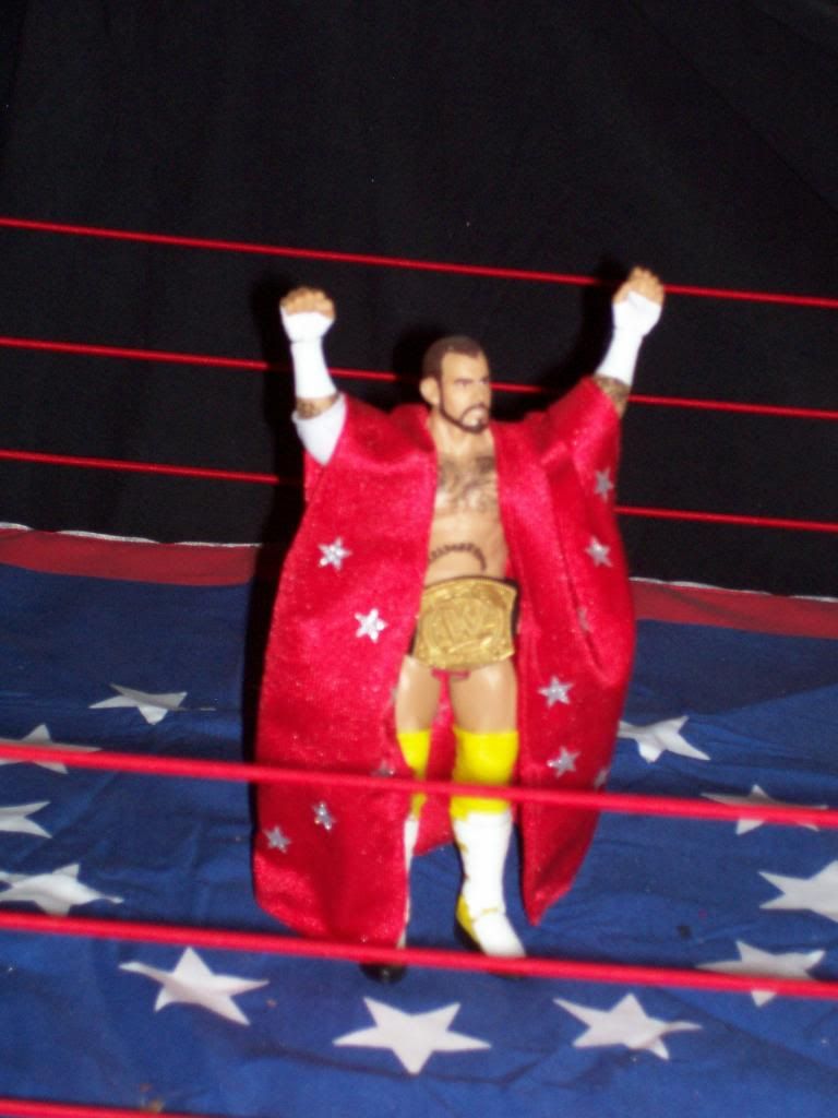
Sandman: I actually do like the dry brushing on this. The detail on the hair is a little chunky I think, and the face is a bit older looking of a face. But it's good.
NYDream: I think you've done a nice job making the details and edges of this nice and tight, which is a big gripe of mine on usual posed customs. But it still looks a little rough, I'm not sure if it's the sculpting or the painting. I think the painting. You smooth out the painting, and you're going to be great. The lines on the edging of the singlet and stars are just a bit too shaky.
Texacide: This is really simple, but I can't complain about it. I don't know why it seems like your competition stuff isn't usually as good/complex as your normal stuff. Normally it's the other way around. If you make it through, try something more difficult next round.
----------------------------------------
Customkenny: This is about on par with your normal stuff, but in this company you have to step up a bit.. more facial definition, tighter logos, better pictures, to make it to the next level
Biohazard: I had to look this guy up, you should provide a ref pic in case people are too lazy to look him up. I think this is really clean, the lines on the tights and everything, it's just really simple. It came down to you and Tex for me for the last spot, and his was just a bit more detailed and complete.
MAIN EVENT:
Famous J wins: this is pretty sweet. The facial sculpting is really good, the skintone is nice... I don't really have a complaint.
Jay: the chest sculpting is a little uneven, which is what took you down a notch for me. I like the shading on the face and the detail on all of the tape, but the edges are just a bit rough.


![[x] TEXACIDE [x] Avatar](http://i42.tinypic.com/2kj7a1.png)


