MizTV
Main Eventer
 I AM I AM!
Joined on: Sept 10, 2012 19:01:34 GMT -5
Posts: 2,642
|
Post by MizTV on Feb 9, 2013 17:57:29 GMT -5
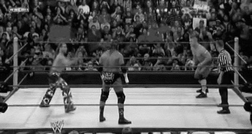
Stip-TNA wrestling Size-whatever MrBITW25  MizTV 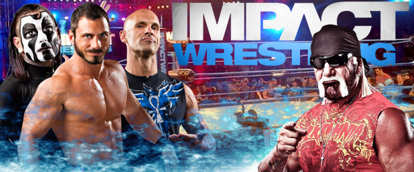 First to 3 Good Luck |
|
thepeepman
Mid-Carder
Joined on: Nov 28, 2012 21:32:28 GMT -5
Posts: 341
|
Post by thepeepman on Feb 9, 2013 19:11:50 GMT -5
miz tv gets my vote merges together better
|
|
|
|
Post by mrbestintheworld25 on Feb 9, 2013 20:18:34 GMT -5
Yes that is my design im MrBestintheworld25 i just changed my name haha. anyways good luck 1-0 so far
|
|
|
|
Post by Parchandri on Feb 10, 2013 17:32:55 GMT -5
miz tv gets my vote merges together better I'm not trying to be rude, but we need a bit more of an elaboration when someone votes for it to count. Punkisgod's piece really suffers from its size. While I can't find anything horribly wrong with the graphic itself, the size is very distracting. Everything seems so compact as a result of the size, even the text is hard to read. The color scheme is certainly fitting, and while it's not great, the blending isn't too bad. MizTV, I feel like this is one of your better, if not best pieces you've posted on this board. I enjoy the placement of the text behind Hogan, I think it's a nice touch, and it works because it's still readable for the most part. The color scheme is nice, and the layout isn't bad. I however really dislike the blue cloud looking effect you used. But other than that, it's a decent entry. My vote goes to, MizTV |
|
MizTV
Main Eventer
I AM I AM!
Joined on: Sept 10, 2012 19:01:34 GMT -5
Posts: 2,642
|
Post by MizTV on Feb 12, 2013 12:42:15 GMT -5
I need one more vote for me and 3 for Punk. Keep voting!!
|
|
|
|
Post by Elliot on Feb 12, 2013 12:50:43 GMT -5
My vote goes to MizTV simply based on the size. Had BITW's been bigger, it probably would have won since it has a better design and more effort has been put in to including images and the blending. But the small size really hurts it and you can barely see what's going on.
MizTV has the clean graphics that you can actually see, but there's nothing special about it. It's four renders on top of a low quality image with a low quality texture overlaying the piece. And the Impact logo looks incredibly flat without drop shadow, like it's just stuck on there.
Based solely on the fact that I can actually see Miz TV's entry. I'm going for him.
|
|
Deleted
Joined on: May 3, 2024 20:49:39 GMT -5
Posts: 0
|
Post by Deleted on Feb 12, 2013 23:39:15 GMT -5
|
|
|
|
Post by Elliot on Feb 12, 2013 23:43:14 GMT -5
It's already been noted in the Rules and Rankings thread. But thanks. |
|